PayVDA App
Crypto without the chaos.

Service
Web Design
Branding
Art Direction
Tools used
Photoshop
Framer
Year
2026
Everyday money
A crypto wallet for normal decisions
Start with the product
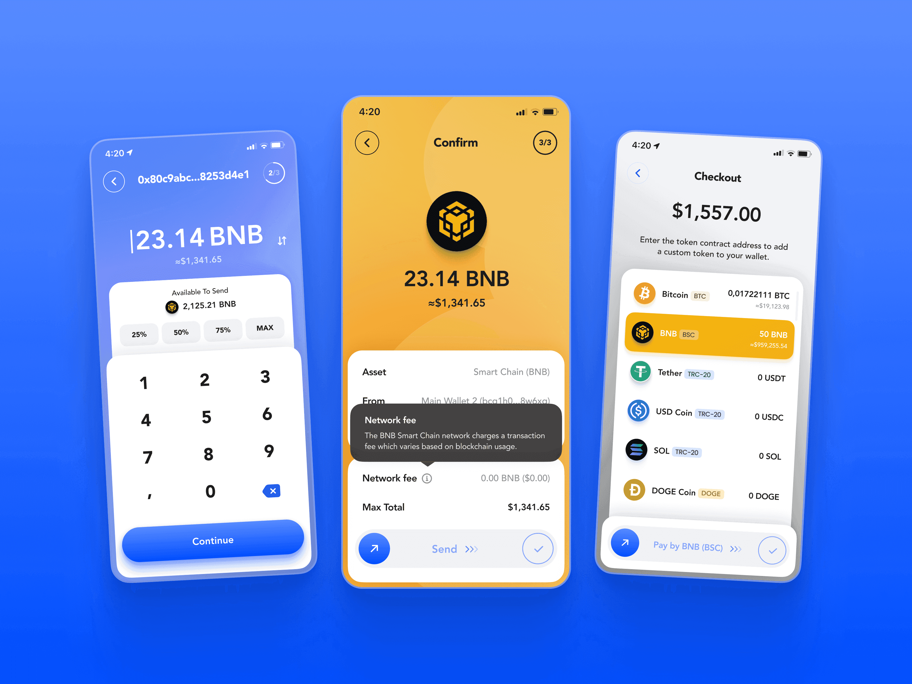
PayVDA started as one of those projects that look simple only if you describe them in one sentence: a crypto wallet for India and the UAE, focused first on India, with QR payments, real-time crypto-to-fiat conversion, multi-chain wallet creation and import, KYC where it actually matters, and a plan to make crypto usable around something as normal and everyday as UPI. On paper, this sounds like a product task. In reality, it was one of those cases where the interface was probably the most visible part of the work, while the real work was happening somewhere much deeper: in positioning, in trust, in tone of voice, in making a financial product feel like something a normal person could open without immediately feeling that cold little “I’m going to lose money if I tap the wrong thing” panic.
A working relationship
The founder, Robin, came to us with a fairly clear product idea and a pretty rare level of trust for a first big project. I think part of that trust came from the fact that from the very beginning I wasn’t trying to behave like a polite vendor who agrees with every idea just to keep the invoice moving. If something sounded wrong, I said it sounded wrong. If an idea felt weak, overcomplicated, or just kind of pointless, I said that too. There’s a very specific kind of relationship that forms when a client realizes you’re not only there to draw screens, but also to argue with them when the product needs it. It creates a different kind of energy in the work. Less “here is your deliverable, sir”, more “let’s actually make this thing alive and useful, even if we need to push each other a bit to get there”.
The scope
At first, the scope was app and landing page, and then the project kept expanding in the most natural way possible. Once we had the app concept, the landing page started forming around it. Once the landing page had a direction, the brand needed a more precise system. Once the brand had a system, it became obvious that social posts, ads, product storytelling, investor materials, and the pitch deck should all speak the same language. Over time, PayVDA became a pretty large design organism: brand identity, logo, colors, product UI, onboarding, wallet flows, swap, QR payments, crypto-to-fiat logic, landing page design and Framer implementation, 3D visuals, social content, ad materials, and later a pitch deck that had to explain the product to investors without turning into a boring blockchain PDF. The final product scope had 120+ product screens and a whole ecosystem of materials around the app, but the central question stayed the same the whole time: how do we make crypto feel usable for people who are not crypto people?
The first barrier
Crypto asked too much of new users
The crypto category
Most crypto products still look like they were designed either for traders, terminal addicts, or people who enjoy feeling like they’re entering a very expensive spaceship where every button can destroy their day. The older visual language of crypto was neon, gradients, cyberpunk-ish darkness, endless glowing graphs, and that whole “future finance cult” vibe. Then crypto started becoming more institutional, and a lot of products went in the other direction: clean fintech, banking minimalism, safe blue-and-white dashboards, everything very rational and very serious. Then another layer appeared, the tasteful designer layer, which is often just laconic minimalism with nicer typography and fewer sins. Some products managed to become genuinely memorable — Phantom, Solflare, Family — but most wallets still feel like they were designed around the assumption that the user already knows what they’re doing, or at least has enough patience to pretend.
The everyday user
PayVDA needed the opposite instinct. Its first audience wasn’t the expert crypto guy who already has ten wallets, three browser extensions, twelve tokens he forgot about, and a very developed opinion about gas fees. The interesting audience was the person who has money to send, receive, spend, move, or convert, but doesn’t use crypto because everything around it feels too technical, too risky, too weird, too easy to mess up. For India especially, this mattered a lot, because the product wasn’t trying to invent some abstract Web3 ritual detached from real life. It was trying to connect crypto to something people already understood through UPI and QR payments. The task was almost cultural before it was visual: take a mechanism from the crypto world and make it feel closer to daily payments, small business, friends, merchants, phones, receipts, cards, contacts, and all the boring-normal things that actually make financial products useful.
Familiar by design
Keep the mechanics people already know
Anti-crypto
That’s where the “anti-crypto crypto brand” direction appeared. We weren’t trying to make PayVDA look like another wallet from the same shelf. We wanted it to feel almost weirdly welcoming for the category. Bright colors, rounded shapes, physical objects, friendly characters, playful coins, a wallet icon that actually looks like a wallet, and interface moments where the product behaves less like a dashboard and more like a companion that gently shows you what just happened. The Pixar-style direction was not just some cute visual trick. It solved a real communication problem. Crypto has a trust problem, a complexity problem, and a loneliness problem. When you’re new to it, you feel like you’re alone with a system that will not forgive you. A friendly character holding a card, celebrating a successful wallet import, or guiding you through a small moment doesn’t magically solve the engineering complexity, obviously, but it changes the emotional temperature of the whole product.
The first impression
A lot of the thinking was basically: this should feel closer to Canva than Photoshop. Photoshop is powerful, incredible, deep, and absolutely capable of making you feel useless in the first three minutes if you don’t already know the logic of the tool. Canva has a completely different promise: come in, do the thing, you’ll be fine. PayVDA needed that kind of first impression. Not because the product was primitive, and not because the financial mechanics were simple under the hood, but because the user should not be punished emotionally for being new. The interface had to communicate that someone already thought through the scary parts. You can create a wallet. You can import a wallet. You can send. You can receive. You can scan. You can understand what happened. You can see the receipt. You can go back to the wallet. The product should hold your hand without making a big sentimental performance out of it.
Familiar mechanics
At the same time, we were careful not to over-invent the actual mechanics. That was important. It would have been very easy to get drunk on originality and start replacing known financial patterns with “better” ideas just because we could. But for a product like this, especially at launch, familiarity is part of the trust layer. The wallet looked like a card because people know cards. The product had clear transaction states because money needs clarity. The QR scan had to be obvious because QR payments are already a familiar behavior in the target market. We could add personality around these mechanics, but we couldn’t make the user relearn basic financial logic just so the design could feel special. A lot of our product decisions were built around this balance: keep the structure familiar enough to feel safe, then use the visual layer, motion, characters, icons, and micro-interactions to make it feel unmistakably PayVDA.


Product diagnosis
Make the scary parts feel handled
Product diagnosis
One good example was the wallet dashboard. The main card could change color depending on the asset the user holds the most — green for USDT, orange for Bitcoin, and so on — so the interface could feel alive without becoming chaotic. The central glowing QR/payment button gave the app a recognizable product gesture and made the most important behavior visually obvious. The side buttons were still labeled and understandable, because clever icons alone are rarely enough when money is involved. We explored avatars for recent people and transaction entries, but kept the conversation tied to what could actually make sense in a wallet without creating a fake social layer. Even when the client wanted something more unique, a special “tadka”, as he called it, the answer was never to throw random cool visuals on top. The answer was to find places where the product could feel more ownable without breaking the mental model.
Physical metaphors
The skeuomorphic direction was probably the part I personally enjoyed the most, because it gave the product this semi-physical quality that most modern financial apps have lost. A crypto wallet is already an abstract object by default. It’s keys, addresses, chains, tokens, balances, confirmations, conversions, and a lot of invisible infrastructure. So if you want to make that world easier to enter, physical metaphors become useful again. A wallet can look like a wallet. Coins can feel like coins. A receipt can feel like a receipt. A card can look like something you can hold. These things are almost embarrassingly obvious, but that’s exactly why they work. They create a bridge between the invisible and the familiar, and that bridge matters more for first-time users than some beautifully austere list of assets in a grey fintech layout.


Physical bridge
A wallet can look like a wallet
The wallet icon
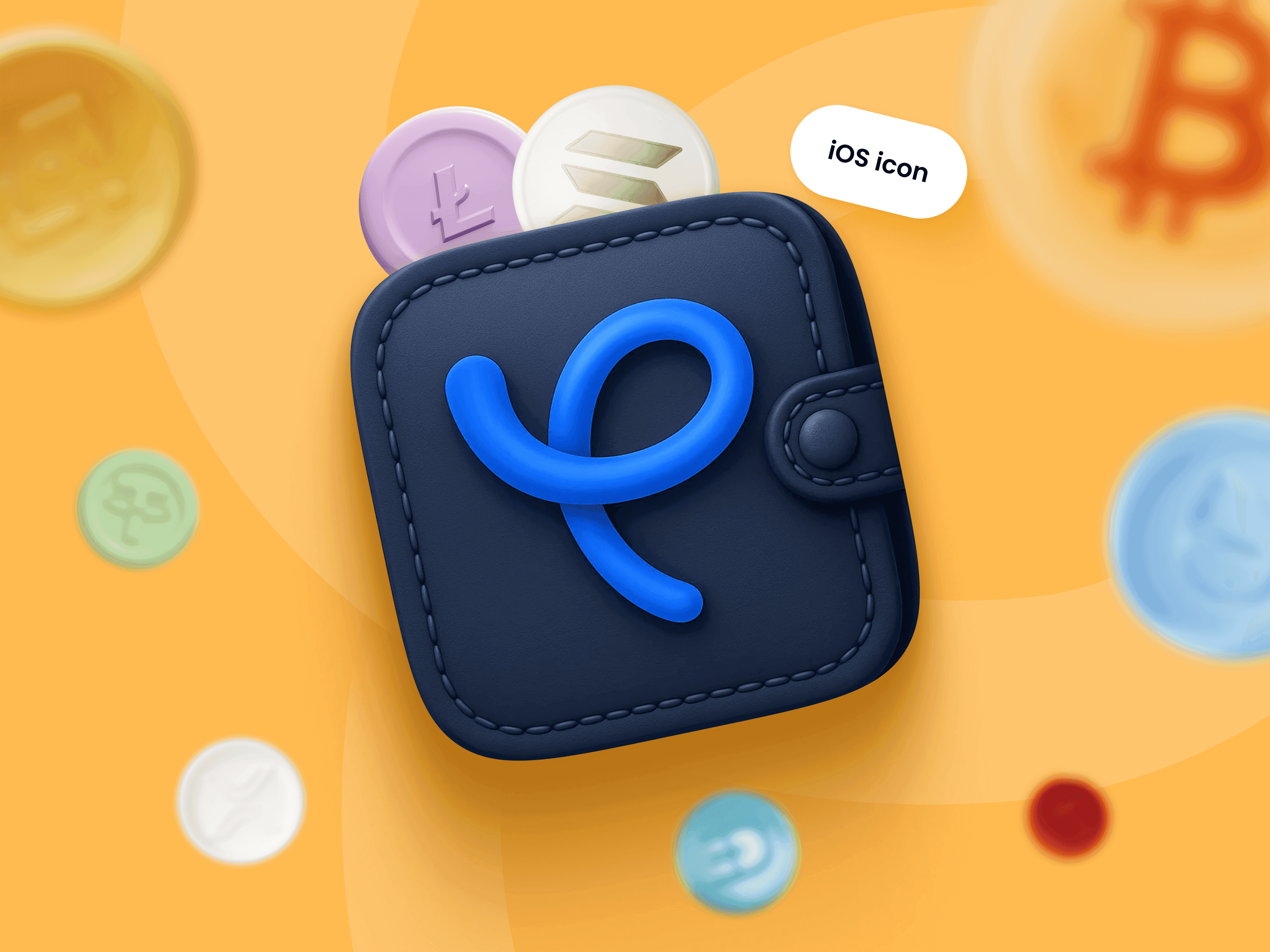
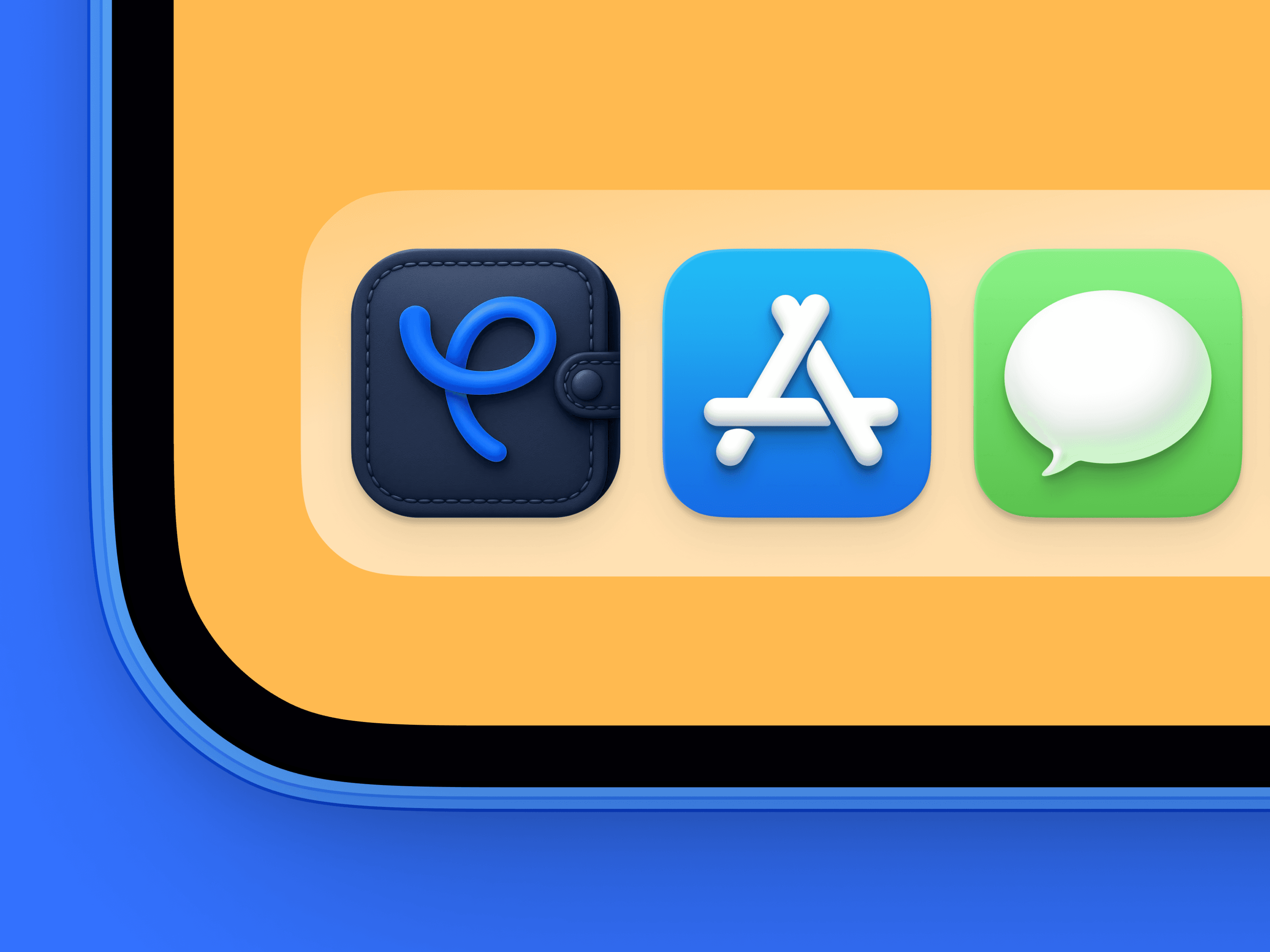
The app icon became the purest version of that idea. I rarely get to make an icon like this for a real product anymore, because most teams either want something flat, something logo-only, or something that looks like it belongs inside a very safe SaaS brand book. For PayVDA, I sat down and drew the icon properly in Photoshop: dark soft material, stitching, a little button, a clasp, a blue symbol that sits on top like a tactile object, everything with enough depth and craft to feel like a small thing you could almost pick up from the screen. I didn’t generate it with AI. I drew it because I wanted that level of control and materiality. I spent enough time on it that I didn’t even bill part of the hours, because at some point it was just my own stubborn desire to make the thing exactly the way I felt it should be. That icon became one of those artifacts that later people brought back to us as a reference without even realizing we had made it, which is always a funny little design-world loop: someone finds your stolen work on Pinterest, brings it to you as inspiration, and you get to say, yes, truly, whoever made this must have been a master.
Small decisions, same direction
There were plenty of small process moments that shaped the final thing. Robin asked for all-lowercase text at one point, and we talked through the trade-off because lowercase can feel more informal and chat-like, but it can also hurt readability. He asked about font directories, and I pushed back because font curation is part of the design work, and having a client choose from a list rarely leads to a better result. We discussed avatars, QR logic, merchant vs. person language, whether the scanner should be universal, how much animation freedom we had, whether Framer would be performant enough, and whether React Native made sense for the app. None of these conversations are spectacular on their own, but together they’re the real texture of product design. A case like this doesn’t become coherent because someone had one genius idea in the shower. It becomes coherent because dozens of small decisions keep pointing in the same direction.
Clear paths, less density
Landing page
The landing page became its own little product theatre. We didn’t want a generic fintech landing where you scroll through hero, features, security, FAQ, done. The idea of “crypto fluidity” became the narrative backbone: flow through crypto, move through payments, scan, pay, send, receive, see clearly. The landing had a narrow active width around 960px, partly because it made responsive adaptation easier, but more importantly because it made the whole page feel mobile-first from the start. It felt less like a corporate website and more like a clean scrollable product presentation. The motion direction supported that too: elements moving upward like a scroll, the blue card and “Your Wallet” label snapping into the phone screen, the blue area expanding to fill the section, labels and arrows appearing gradually as the user moved through the story. Even the multilingual detail — English, Arabic, and Hindi dynamically writing themselves out in an Apple-style animation — was there to make the product feel native to its intended markets, rather than a generic wallet with a different country name in the strategy doc.
Less density
What I still like about the landing is that it didn’t try to prove the product through density. A lot of crypto projects overload their pages because they’re afraid that if they don’t explain every mechanism, nobody will believe them. PayVDA needed confidence in the opposite direction. Big friendly type, clear surfaces, bright cards, a phone in hand, QR logic, coins floating around, characters peeking in from the edges, and enough copy to understand the value without turning the page into a whitepaper. The product already had enough complexity inside it. The website’s job was to make the whole thing feel light enough to approach.
Icons, receipts, and onboarding
Onboarding
The onboarding followed the same idea of being simple without feeling empty. There was no need to explain the entire crypto universe in four screens. The screens had to do something much more focused: create the right first emotional contract. Welcome to PayVDA. Manage your crypto assets in one place. Send, receive, and swap with ease. Stay in control of your keys and funds. Create or restore a wallet in a few taps. That’s it. The illustrations carried part of the weight, because they made the flow feel friendly and complete without dumping text on the user. The success modal with the girl celebrating the imported wallet is a good example of the tone we wanted. It treats a small technical step like a little achievement, because for a new user, importing a wallet can actually feel like one. The product says, basically, “you did it, everything is okay, let’s continue”, and that is a much better emotional state than “here is your address, good luck”.
Pitch deck
The project also had a very strong narrative layer through the pitch deck. That part was especially important because at some point the product needed to become investor-showable faster and cheaper than building a full production app. Token2049 Dubai was part of that urgency, and the deck had to explain PayVDA as a serious opportunity without killing the friendly tone we had built. Alice led a lot of the writing and structure there, and I still think it became one of the strongest decks we’ve done as a team. It had a clean linear logic, the right amount of product story, and a way of presenting the market and the use case that didn’t feel like another crypto deck about abstract adoption. Later, when the deck was refined, we even prepared separate drafts for India and the UAE and reworked the storytelling flow while keeping the same PayVDA voice. That mattered, because by then the brand had already become specific enough that you could feel when a slide belonged to it and when it didn’t.



From wallet to deck
Wallet, brand, and deck in one language
Make crypto usable
And the direction was clear: make crypto feel less like crypto, without hiding what it is. Keep the mechanics real. Keep the product useful. Keep the user in control. But remove the feeling that they’ve accidentally opened a professional tool for someone else’s world. That’s why the project worked as a system. The wallet, the icon, the landing page, the characters, the ads, the social posts, the pitch deck, the product language — everything was orbiting the same central idea. PayVDA was a crypto wallet designed for people who actually have everyday reasons to move money, but don’t want to become crypto-native just to do it.
A world around it
Looking back, the thing I like most is not one particular screen, although there are plenty of screens and scenes I still love. I like that the project produced a whole set of visual artifacts that feel alive outside the app itself. The icon stands on its own. The landing has its own rhythm. The wallet screens have their own product logic. The success modals and receipts feel like little moments, not placeholders. The pitch deck has a narrative spine. Even the social content had a direction beyond “post some pretty stuff”. That’s rare, because many product projects become a pile of well-designed surfaces with no atmosphere between them. PayVDA had atmosphere. It had a world.
The trust to build it
It also had the kind of trust that makes this work possible. Robin didn’t just buy screens from us. He let us argue, recommend, push back, make the project friendlier than the category usually allows, and build a product image that was unusual for crypto without becoming unserious. That’s probably why the project stayed coherent even as the scope expanded from app and landing into brand, visuals, content, pitch materials, and development conversations. The core never changed. We were building a wallet that could bridge crypto and everyday payments, but the design challenge was bigger than that: we were translating an industry that loves complexity into a product language that could survive first contact with normal people.