Roketo App
AI was the production pipeline.
Service
Web Design
Art Direction
Motion Design
Tools used
Figma
Year
2024
Two weeks, one bet
The visual identity had to do the marketing
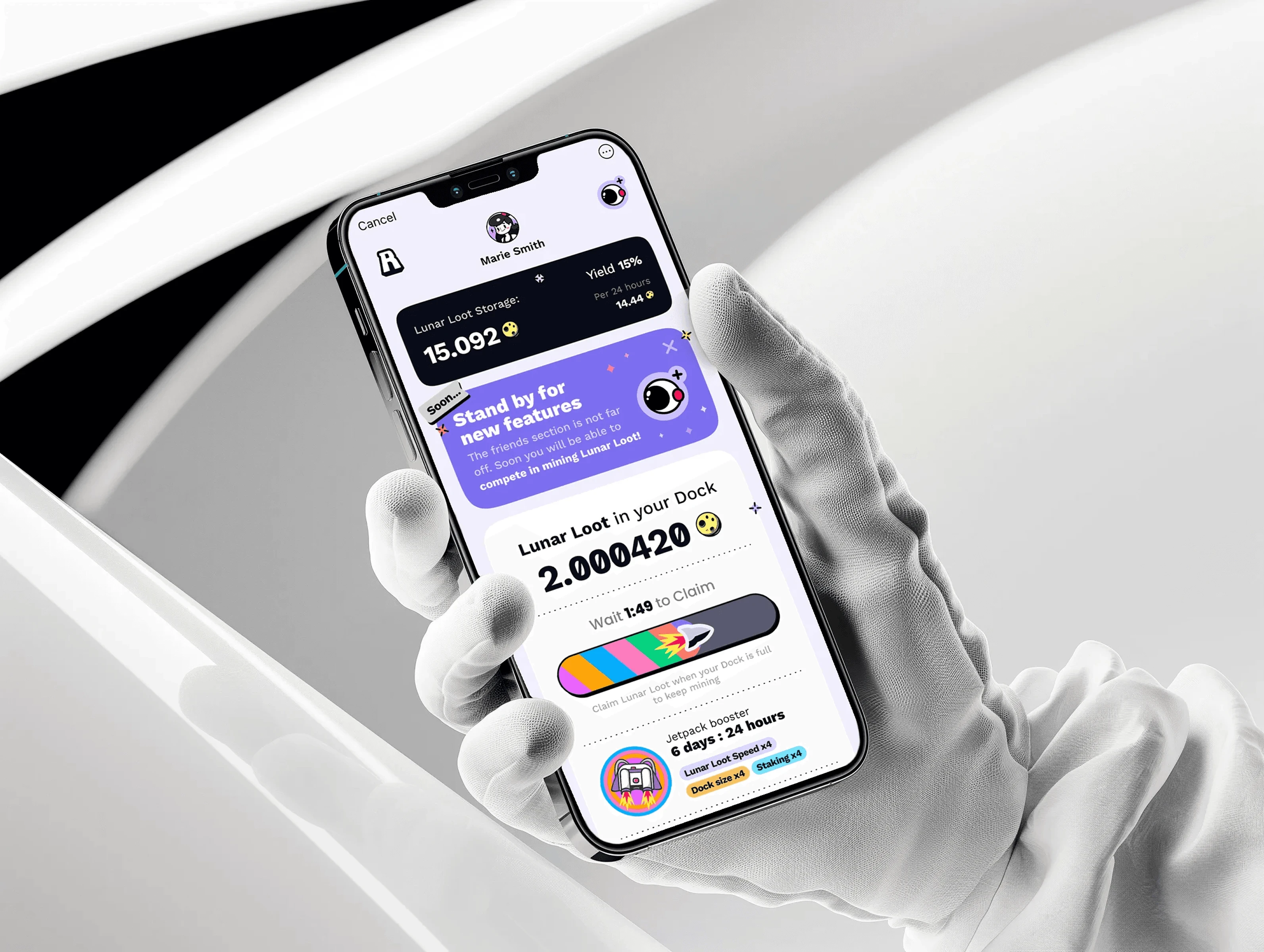
2024. Everyone uses AI to generate moodboards. We used it to ship an entire product — icons, characters, backgrounds, UI elements. All Midjourney. 250,000 users in month one. ~$5,000 in marketing.
The missing asset
We could not draw, hire, or wait
The constraint that shaped everything
Sasha Isaev came to me during peak Hamster Kombat era with a Telegram Mini App that needed to attract a massive audience for his L3 chain, and the brief had a specific asymmetry that I found interesting from the start: UX could be predictable — lean on what the tap-to-earn market already trained users to expect — but the UI had to be so visually different that it could functionally replace a marketing budget. Near-zero spend on ads, with design itself being the mechanism that makes people share.
Two weeks to build the first version, no existing assets beyond a landing page with some colors, and the product clearly needed illustrated characters — warm, cartoonish, personality-driven, the kind you’d screenshot and send to a friend rather than scroll past. Not stock vectors, not 3D renders. Something with soul.
The problem is that we can’t draw. I’m genuinely terrible at illustration, the timeline ruled out hiring someone, and stock was out because it would chain every creative decision downstream to someone else’s asset library. So the constraint crystallized into something very specific: we need a visual identity built entirely on illustration, we can’t illustrate, we have two weeks, and the result has to be good enough to carry the entire go-to-market. That’s the box we were in.
AI as production
Every visual came from the same fight
AI became the pipeline
I’d been running hundreds of Midjourney generations a week at that point — not for concepts or moodboards, just learning the tool, its quirks, its stubbornness, where it surprises you and where it completely falls apart. The design industry at the time was treating AI generation as a concepting layer: generate something, get inspired, then make the real thing by hand. Nobody was using it as an actual production pipeline for a shipped product.
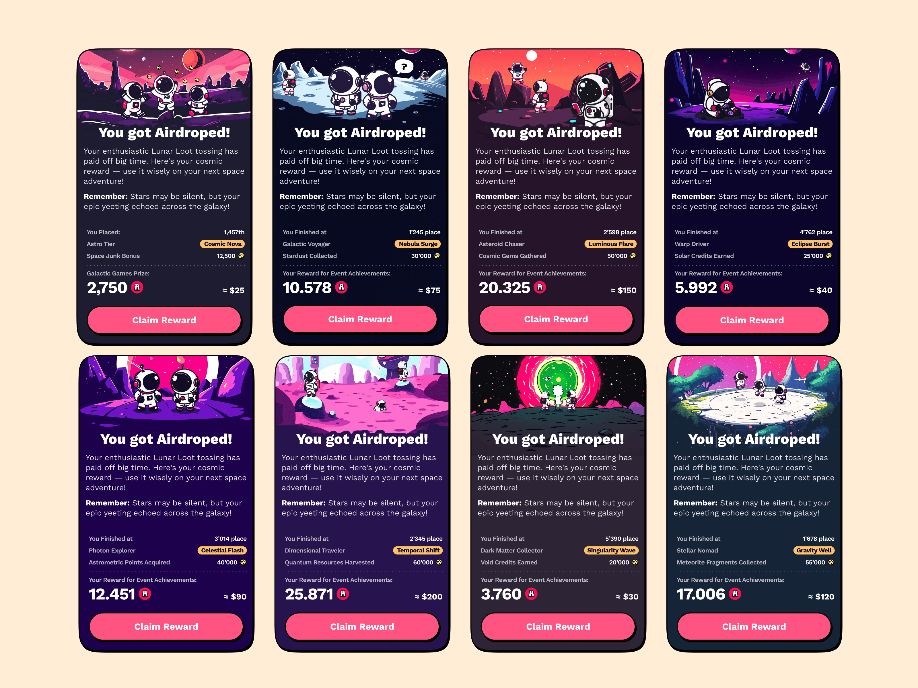
I generated a few astronaut characters on a hunch — little goofy cosmonauts — and they came out with exactly the kind of naive charm the product needed, something between children’s book illustration and indie game art. We put one bouncing off the screen edges like a DVD screensaver logo, showed the concept to Sasha, and he said yes immediately.
That was the bet. Not “let’s use AI to speed up our process” — let’s make AI *the* process. Every visual element in the product, from navigation icons to character illustrations to background textures to UI decorations, would come from Midjourney. The tool wouldn’t assist production. It would be production.


Consistency by repetition
A thousand generations became a system
What a Midjourney production pipeline actually looked like in early 2024
No style browser, no fine-tuned style weights, no sref controls — the tool was powerful enough to generate beautiful individual images and too dumb to maintain any consistency between them, which is the single most important requirement for a product’s visual identity.
My solution was brute force. I maintained a set of five or six reference images, including finished app screens, and attached them as style anchors to every single generation — every prompt carried these references, like showing up to work every morning with the same stack of printouts to re-explain the project to a brilliant artist who has amnesia. Sometimes it clicked on the first try. Sometimes the tool decided it had never seen your references and gave you something from a completely different universe.
Over a thousand generations across the project. When we later added a city-building feature, I generated all the buildings in about a day — that went fast. But then there was the pickaxe. There was a tap-to-mine mechanic where you tap the screen, a pick hits a stone, loot falls out, and I needed one cartoon pickaxe — two-sided, pointy, matching the style of everything else. Midjourney gave me hammers, one-sided picks, shovels, things with teeth on one side only, and I went through style references, image references, iPad sketches, every prompting trick I knew, hundreds of attempts over several hours for a single object that a junior illustrator would sketch in fifteen minutes.
But this is where the approach reveals something non-obvious. A junior illustrator would draw one pickaxe in isolation. I was building a system where every visual element came from the same generative source, and the pickaxe had to fit an aesthetic that existed not as a style guide on a Figma page, but as a statistical tendency across a thousand generations. When everything comes from the same imperfect source, the imperfections themselves become the style. It all coheres into something you genuinely cannot replicate by mixing AI-generated assets with hand-designed ones. The tool’s limitations became the product’s visual signature.
Against tap-to-earn sameness
Why this worked in this specific market
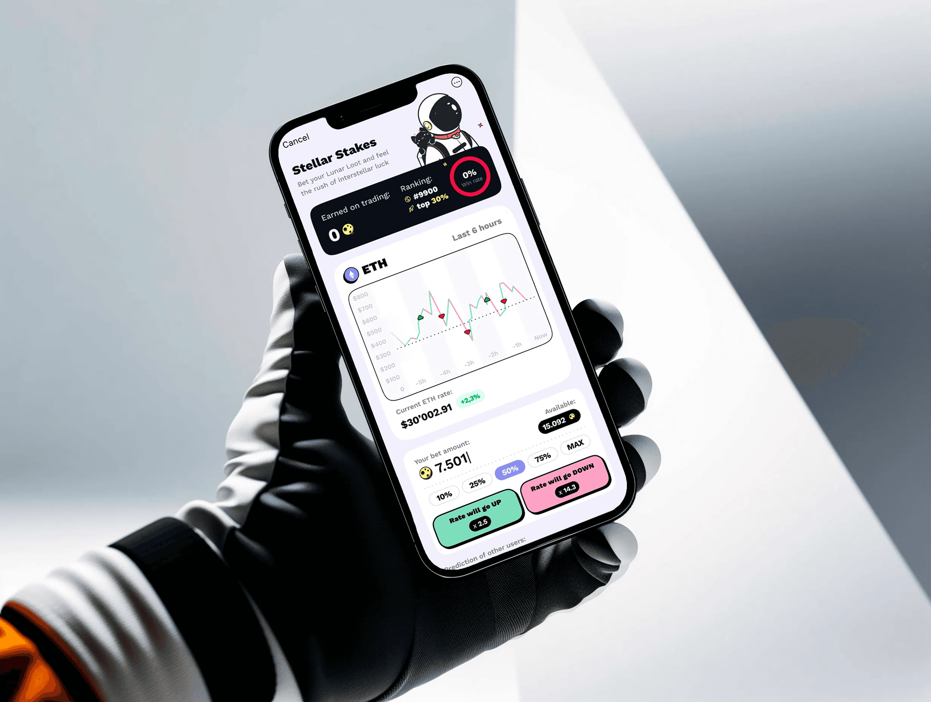
Telegram Mini Apps in crypto were — and mostly still are — visually awful, built from generic UI kits with token logos slapped on top, and the design bar wasn’t just low, it was underground. This context matters, because the 250,000 users didn’t show up because we hit some absolute quality threshold — they showed up because the contrast between Roketo and everything else in that ecosystem was so sharp that the app became remarkable in the literal sense, worth remarking on.
The message people passed around in crypto community chats wasn’t about yield or tokenomics — it was “look at these funny astronauts.” The design did exactly what Sasha asked it to do: the job that money would normally do.
And this virality was designed, not accidental. From day one, the cosmonauts almost never appear alone — on onboarding screens, loading states, feature illustrations, there’s always a group, multiple characters doing things together, which is a deliberate visual message that this is a social experience, bring your friends. We decided on this approach before writing a single line of referral copy.
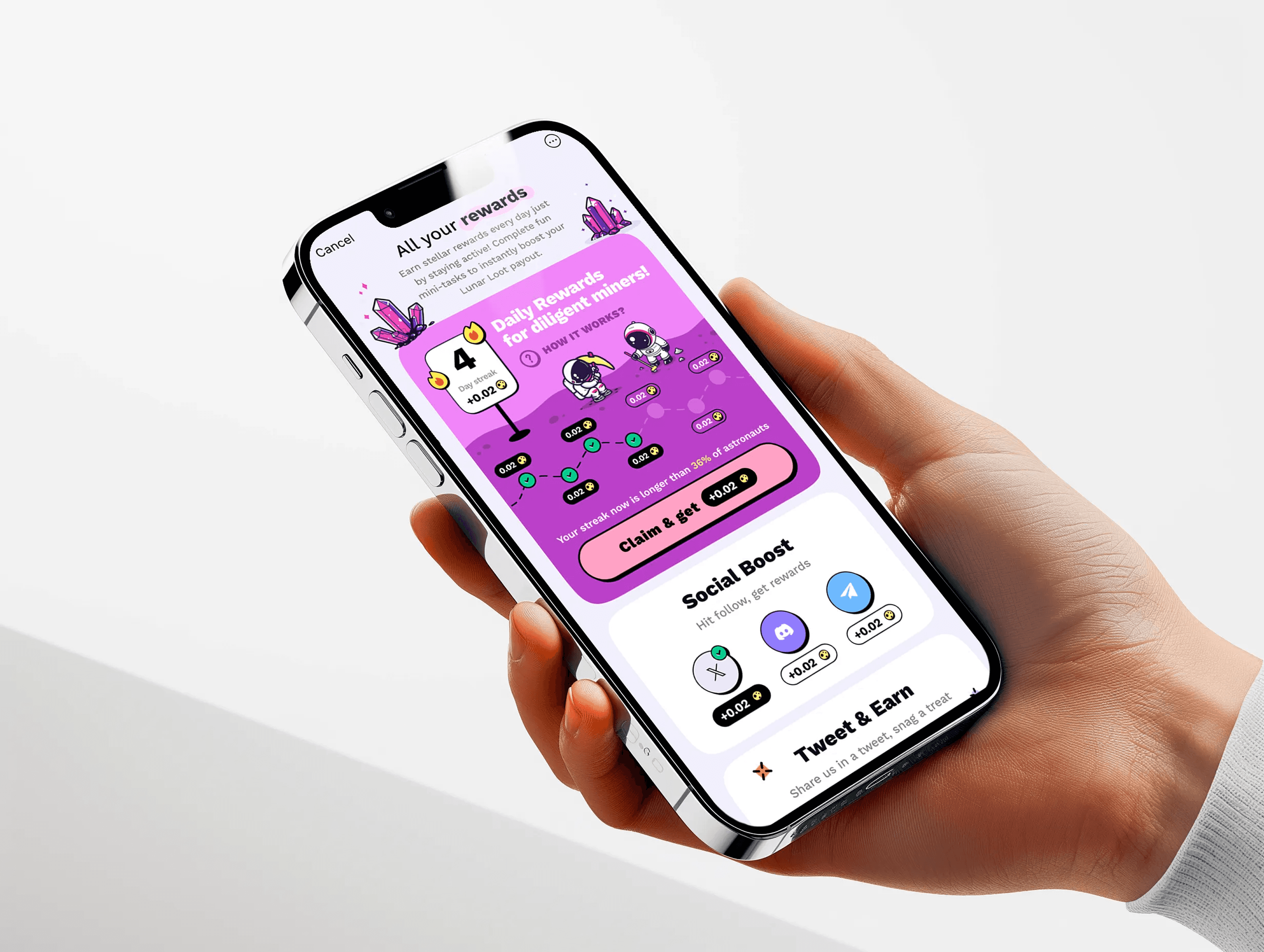
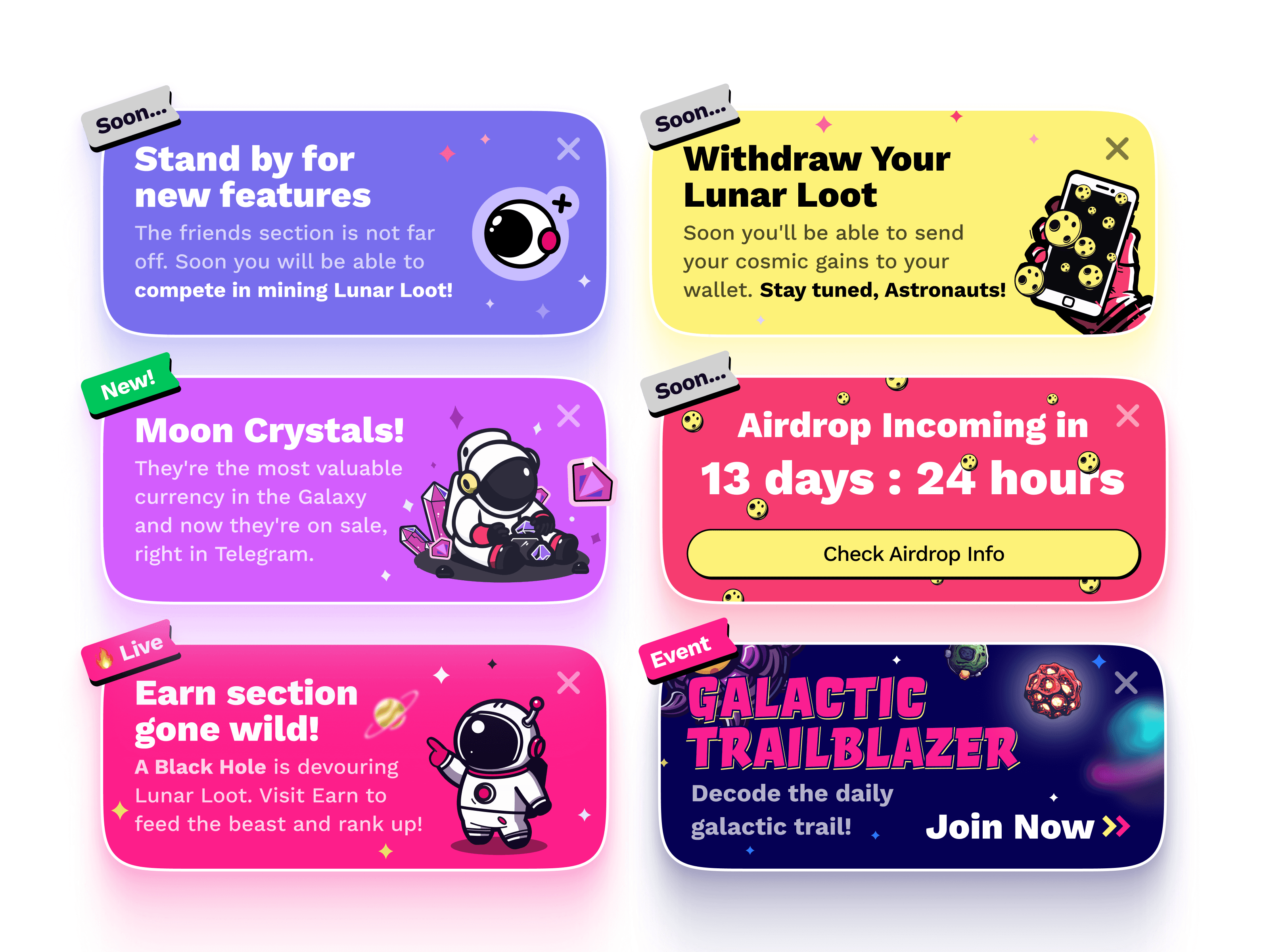
The tone of voice across the entire app was deliberately absurd, and I’d genuinely recommend opening it just to read any random notification, because things happen to the cosmonauts, they have little storylines, the notifications read like dispatches from a tiny unhinged universe, and you come back partly to check your progress and partly because you want to know what these idiots are up to now.
I think about Water Llama a lot when explaining this — it’s an app where I paid for a lifetime subscription to a water-drinking reminder, a function identical to fifty free alternatives, because the camel on my Apple Watch is cute and everything makes pleasant bubbling sounds. You’re paying for a tiny world you visit for a few seconds each day. That’s what Roketo was.
Teach by discovery
Let the world explain itself
Teaching without explaining
Most tap-to-earn apps have a simple cognitive contract — tap, earn, done. Roketo had its own mechanics, its own economy, its own vocabulary: Lunar Loot, Docks, harvesting, boosts. A new user launches the app with zero framework for understanding any of it.
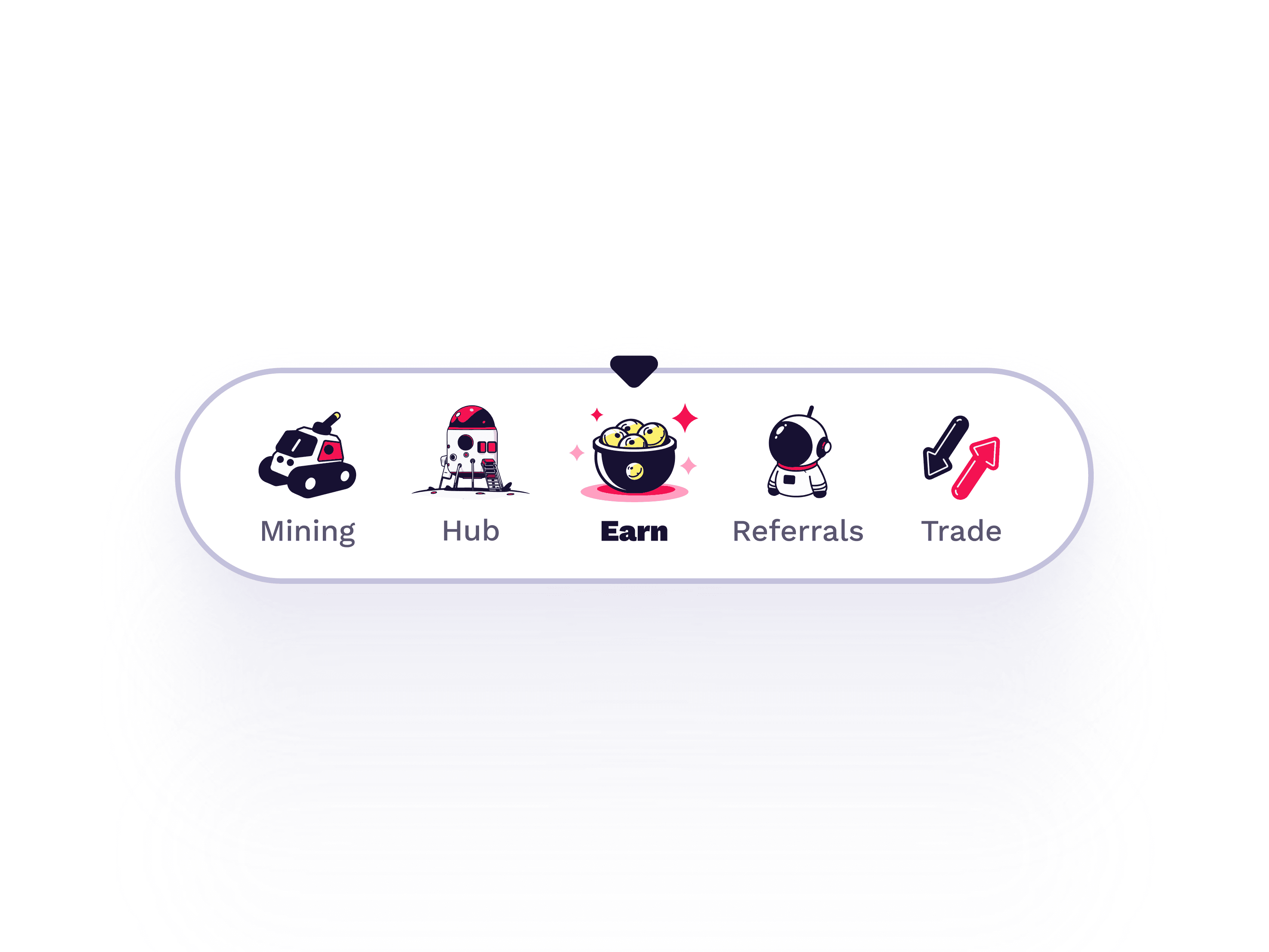
We went the opposite direction from tutorials. The first thing the app tells you is “X Lunar Loot has been sent to your Dock,” the Dock icon glows, and you don’t know what Lunar Loot is, you don’t know what a Dock is, but you know you received something and something is highlighted.
I think of this as the Morrowind principle — drop the player into an unfamiliar world and let curiosity do the teaching, where every unknown word is a hook rather than a barrier. You tap the glowing icon, it opens, explains itself, shows you how to upgrade, and now you want to know what Lunar Loot actually is, then what it’s for, and each discovery branches into the next like wandering through Skyrim and picking up quests you weren’t looking for.
An unfamiliar term in a banking app is a UX failure. An unfamiliar term in a game about space cosmonauts mining lunar loot is an invitation.


What it did
Design carried the launch
The trade-offs I’d take back
The leaderboard is the one that still bothers me — navigation structure was locked by the time we added it, and it ended up as an appendix, technically present but hard to reach.
Animation is the biggest sacrifice. The budget didn’t allow for it, and this was the right trade-off at the time, but the product would have been substantially better with even basic motion design. It’s the most visible gap in the finished product.
Geo distribution was poor — mostly Nigeria, Indonesia, users with no spending power. That’s a marketing problem more than a design one, but it affected the project’s commercial outcome regardless.
What the pipeline left behind
People started copying our cosmonauts on Dribbble and Pinterest — same characters, same poses, showing up in other people’s projects. We never pursued anyone. Felt like confirmation more than theft.
This project exists at a very specific intersection of timing and stubbornness. Midjourney in early 2024 was powerful enough to generate production-quality assets and limited enough that getting consistency across an entire product required a handmade pipeline of reference images, brute-force iteration, and a tolerance for spending hours on a single pickaxe. Today’s tools would make the same project faster, cleaner, more technically refined — they’d also make it less interesting as a story, because the difficulty was the point, and the aesthetic came from fighting the tool rather than from the tool cooperating.
What the project proved is that a generative AI pipeline — not as a supplement to production, but as production itself — could define a product’s entire visual identity, and that identity could be distinctive enough to replace a marketing budget in a market where everything else looked the same. That was the bet. It paid off.


