Open Wallet
The retainer became the team.
Service
Web Design
Art Direction
Branding
Tools used
Figma
Framer
Year
2025–2026
The first sprint
A strong wallet that looked familiar
Cold outreach through a Telegram network. First sprint: seven screens of a debit card flow. Six months later, the previous team is gone and we’re the only design function the product has. A year in, we’re speccing features that shape the company’s business strategy. 93 tasks. One retainer. No formal pitch ever.
The cold open
Mitul Manish — co-founder, CPTO — had a design problem he couldn’t name. Open Wallet was a technically solid self-custodial crypto wallet with a patented keyless recovery system, free Solana transactions, built-in bank transfers via IBAN, and a real user base north of 45,000. The engineering was strong. The product looked like every other crypto wallet: dark theme, flat illustrations, a color palette and rendering style close enough to Trust Wallet that you’d mix them up at a glance. Not bad. Just invisible.
He had a team handling design. He wasn’t happy with them. Alice reached out through our Telegram network, and the timing landed. First message in the work chat, March 25, 2025: “Mitul — meet Ivan and Marie.” Mitul’s first message to us contained a sentence that turned out to be our job description for the next year: “I am not a designer.”
The first sprint was modest by any measure: quick audit, card flow wireframes, clickable prototype, UI for five to seven screens. Fixed price, two-week sprint. We didn’t even have a legal entity yet — Alice invoiced as an individual.
A visual opening
Recognition had to start before the feature list
The thing that changes the relationship
Two weeks into the first sprint, before it was formally over, I wrote Mitul a message nobody asked for. Not about the card flow. About the product’s visual identity. The argument was simple: Open Wallet’s illustration style was too close to Trust Wallet. Same flat vectors, similar palette, similar rendering logic. It wasn’t hurting anything, but it wasn’t building anything either — the product had no visual signature a user would remember or a competitor couldn’t replicate overnight.
I proposed a shift to 3D. More flexibility, more identity, motion-friendly assets for onboarding, a natural bridge to their planned physical cards. Mitul’s response: he personally didn’t love the current illustrations either. Felt they were disconnected from real-world objects because of how flat everything was.
This was the first moment we stopped being contractors executing a brief. Nobody asked us to evaluate the visual language. Nobody put “3D exploration” in the sprint scope. We saw something we could fix, built the case, and proposed it. The second sprint already included the 3D direction as a formal deliverable.
There wasn’t one clean moment where the relationship shifted. But I’d mark this as the point where the pattern locked in: we show up with ideas, not deliverables. Everything after was that pattern repeating.
The brand that started as a website
Mitul asked us to update the website. “Continue with website for the moment” — that was the brief. What we delivered was a visual identity for the entire product. He sent references he liked: family.co, phantom.com, coinbase.com/wallet, strike.me. We looked at all of them and pushed back — they felt too playful, too startup, too crypto. We’d agreed on moving Open Wallet away from that territory, and these references were pulling it right back.
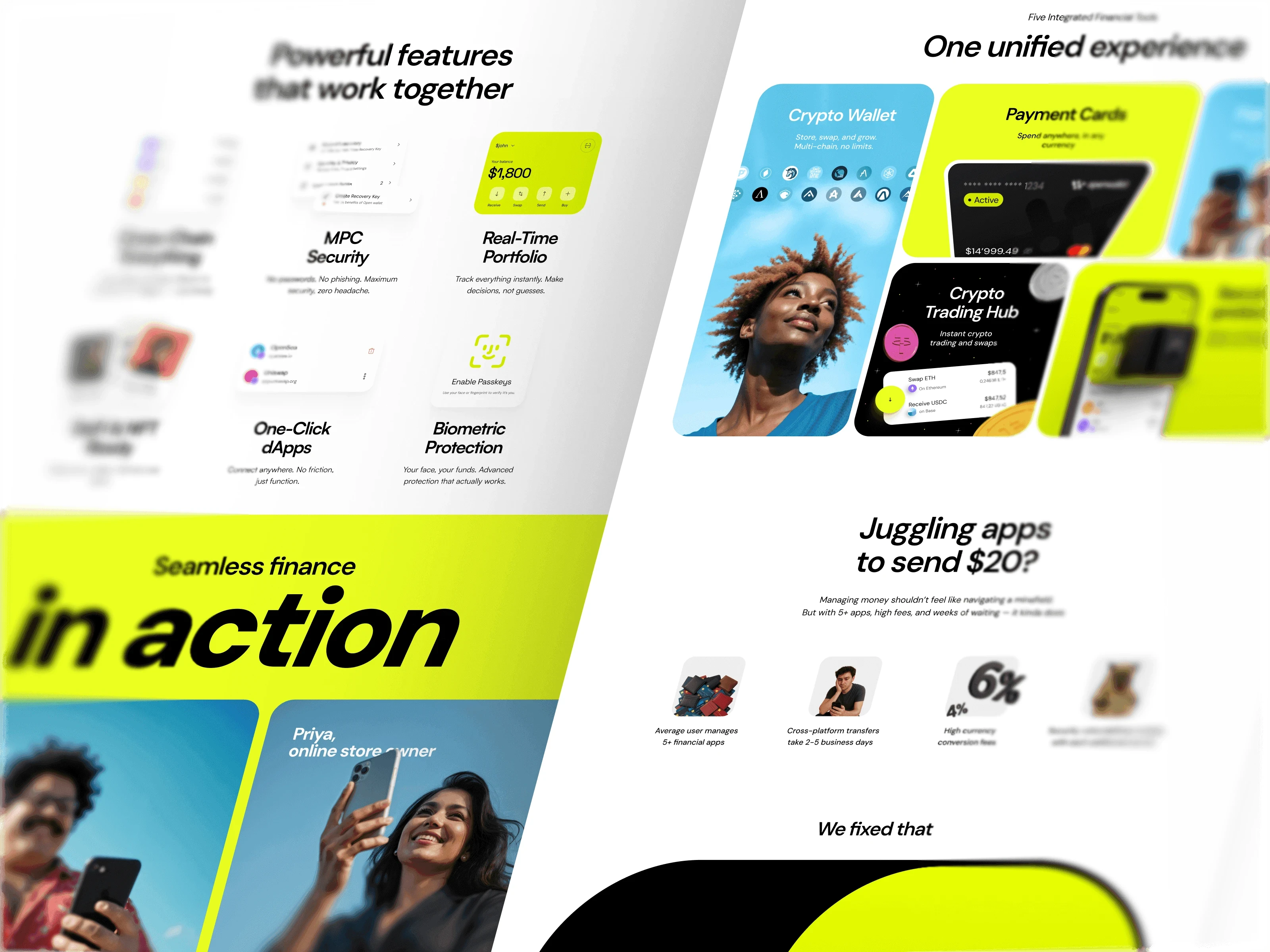
The concept I built started from Frutiger Aero. Not the visual language — not the reflections and transparency and gloss — but the philosophy underneath it. The reason Frutiger Aero worked wasn’t the shiny surfaces. It was the idea that technology should feel like clear sky, like open space, like something made for people with lives and errands and Tuesday mornings. That’s what I wanted for Open Wallet, stripped of the decorative layer and rebuilt for 2025.
Blue sky as the visual anchor — not a dark crypto interface but a light, warm space. Real people — AI-generated at photographic quality, retouched to studio-shoot standards, each carrying an Open Wallet username, surrounded by floating UI fragments that show features in context. And usage scenarios instead of feature lists, because the point of Open Wallet isn’t that you can transfer crypto to a card — it’s what that capability lets you do with your afternoon. Same logic as buying an expensive jacket: you’re not paying for the jacket, you’re paying for how you feel wearing it.
Mitul wanted a version without the people. I wrote him a long message explaining why that would gut the concept — remove the humans and you lose the story, and the site turns into a feature showcase that could belong to any wallet. We built both versions and shipped both to Framer so he could compare on a live site.
Then a user sent Mitul feedback criticizing the visual direction, and Mitul forwarded it to us. I was direct: user interviews are 99% noise. The second you ask a random person what they think about a design, they step into an expert role they’re not qualified for, feel pressured to sound smart, and start inventing opinions. Bounce rates, conversions, deposits — that’s the data.
Alice backed this up with a visual comparison: one design built on team instinct, one built on “best practices” and user feedback. The difference was obvious. The site shipped. Stakeholders loved it. And the visual language we’d created for a website — the sky, the people, the warmth — migrated into the app, into promo videos, into partner decks, into app store screenshots. A deliverable that started as “update the website” became the brand.
From sprint to retainer
Ideas turned a sprint into a team
How a retainer happens
Nobody plans a retainer. It shows up when the contract can’t keep up with the work. Sprint one was fixed scope, fixed price. Sprint two added hourly extras at $70/hour for requests that spilled over — card customization, Mastercard logo placement, things that didn’t fit the box.
By late May, tasks were arriving faster than sprints could contain them: website, videos, moodboards, product updates, brand materials, all at once. Alice proposed the retainer — a monthly block of hours, rush fee for emergencies like the partner pitch deck we built in a day when Mitul needed it for a stablecoin meeting. He agreed immediately because the alternative was negotiating scope on every new request, and by then there were new requests every day.
The shift wasn’t strategic. It was the format catching up with the fact that we were already functioning as the product’s design team — we just hadn’t called it that.
September
September 16, 2025. Six months after the first message. Mitul wrote in the chat: the previous design team was gone, Unipaws was now working exclusively on Open Wallet. “And it goes without saying how much I love working with the team.”
What changed practically: everything came to us. Strategic features, country flags for forms, LinkedIn banners, production UX fixes. Daily communication with Mitul on strategy, daily communication with A G — dev/PM on their side — on operations. The scope wasn’t “design” anymore. It was whatever the product needed on any given Tuesday.


Beyond the sprint
The brief grew into product strategy
The depth that earns the scope
I want to talk about the prediction markets work because it shows what a retainer makes possible and what sprint engagements can’t buy. January 2026. Open Wallet gets approval from Dflow/Kalshi to launch prediction markets. We’re asked to design the feature.
What we delivered: a research study of fourteen platforms — Robinhood, Polymarket, Revolut, Coinbase, Binance, nine others — not a screenshot gallery but strategic analysis with specific recommendations. A product spec running nineteen sections. Thirteen FigJam flow diagrams with color-coded decision logic. A working React prototype. Six promo video concepts, each with its own narrative.
Mitul’s response: “This is one of the main reasons we love working with Unipaws.”
The key design constraint: no gambling aesthetics. Mitul was explicit. Prediction markets in a financial app can’t feel like a betting platform. We framed everything around “price equals probability” — $0.65 means 65% chance, and the interface reads as investment analysis, not a sportsbook. Neutral palette. Green and red reserved strictly for profit and loss.
Nobody asked for fourteen platforms worth of competitive analysis. The brief was “design prediction markets.” But you can’t design this well without understanding how other teams solved the same problems and where they failed. The depth came from caring about whether the feature actually works for Open Wallet’s users — and the retainer is the structure that makes that kind of caring sustainable, because you’re not optimizing for deliverables within a sprint box, you’re optimizing for the product.
The lending research went deeper still. Forty-plus financial products analyzed. The central finding: over-simplifying is as dangerous as overcomplicating. Users lose collateral because they don’t understand liquidation, but dense interfaces kill adoption before anyone gets that far. The solution: make the simplest path also the safest, and replace the scariest metric — loan-to-value ratio — with two things anyone understands: a color-coded health indicator and a liquidation price in dollars.
Against invisible wallets
Open Wallet was technically strong but visually close to Trust Wallet. The opportunity was not to make another dark crypto interface; it was to build a recognizable financial product with a point of view.


93 tasks later
One language across the product
What a year looks like
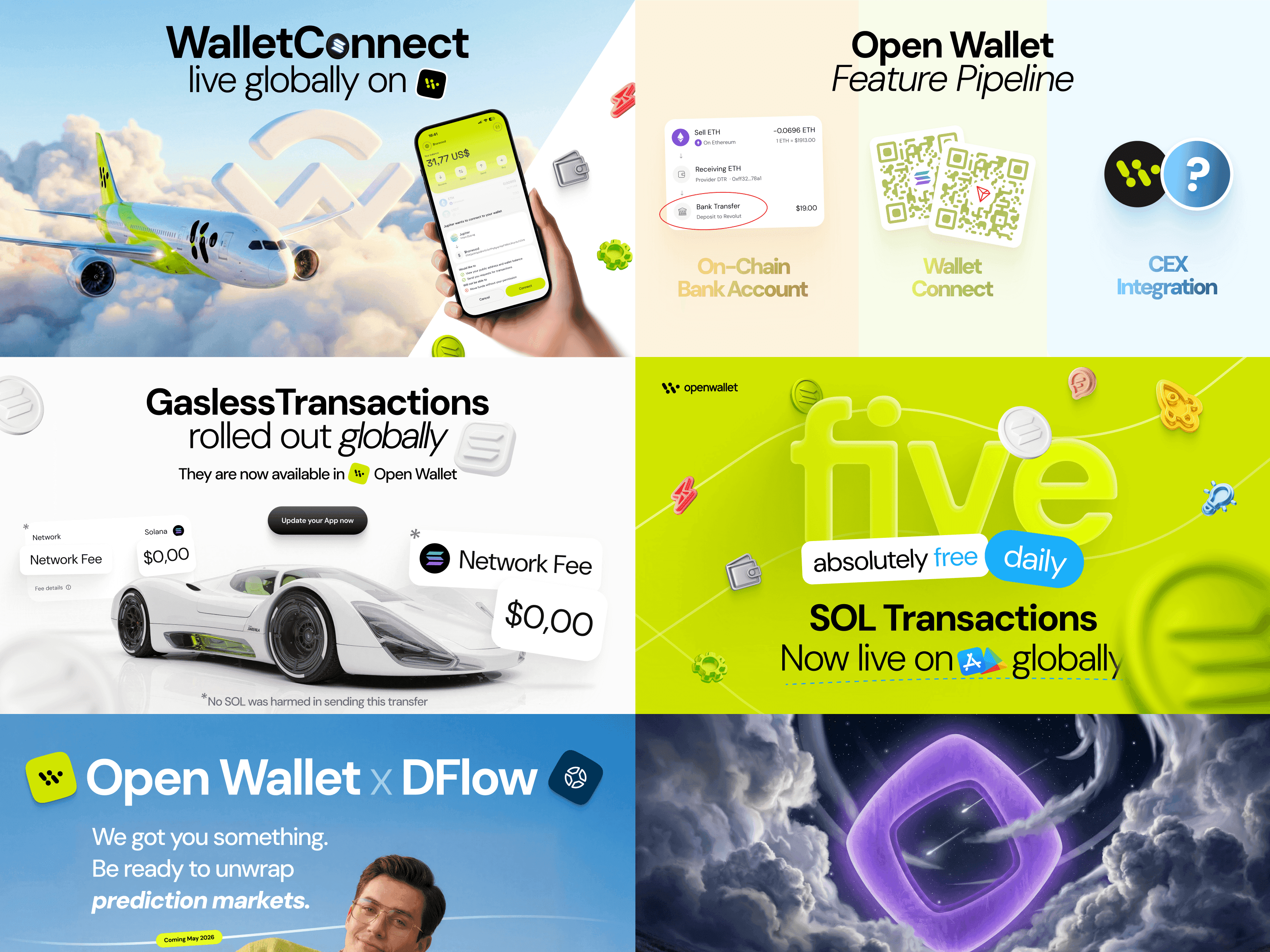
Debit card flows. A website that became a brand. Partner pitch decks built in a day. KYC flows. Notification center architecture. Gasless UX fixes where “0/5” read as “zero out of five used” when it actually meant “zero remaining” — the kind of thing that only surfaces in production and only gets caught by a team watching the product after handoff.
CEX swap interfaces designed revenue-first because the client said “simplicity over beauty” and we agreed, and then a debit card onboarding with 3D animations and haptic feedback because that same client also wanted magic, and knowing which context calls for which approach is the job. Off-ramp flows — ten steps from stablecoins to money in your bank account. Payment links. On-chain bank accounts. Nigeria expansion. App store screenshots redesigned after Apple rejected an update. A design system reorganized from legacy chaos into a functioning library.
Ninety-three tasks. Some were a meme with Patrick from SpongeBob. One was a nineteen-section product specification. The range is the point — when you’re the design function of a product, nothing is beneath you and nothing is above you.
A face for financial tools
The visual language started with blue sky, warm light, real people, and usage scenarios instead of feature lists. The goal was to give a technically strong product a face of its own.




From external to internal
An external team became the design function
What the relationship became
This case study is about what happens when an external team earns the position of an internal one. Task by task, pushback by pushback. The model is called a retainer, and the mechanics are simple: monthly hours, flexible scope, daily communication. But the mechanics aren’t the thing.
The thing is treating someone else’s product as if your name were on it — and meaning it in a way that shows up at 6 AM when a pitch deck is due, or in a fourteen-platform research document nobody requested, or in a Slack message three weeks after screens shipped flagging something that doesn’t look right in production.
Open Wallet went from a crypto wallet that looked like Trust Wallet to a financial product with a face of its own. That happened across a year of retainer work, not in a single dramatic moment, but through accumulation — every small decision pointing the same direction, a team that showed up every day and treated the product as theirs. It wasn’t ours. But that’s the whole point.