EZ Wallet
A wallet grew into a payment system

Service
Product Design
Art Direction
Branding
Tools used
Figma
Year
2026
Overview
Building a portfolio that feels less like a showcase and more like a conversation.
A customer follows a payment link from a chat. They want to pay for a booking, support a creator, or buy access to a course. Somewhere along the way, they may need to verify their identity, use a bank card, or connect a crypto wallet.
EasyWallet had to connect those steps without losing the reason the customer came there. What started as a wallet brief grew into a broader design project: a wallet, a payment layer, a merchant interface, and a brand that had to work across all of them.
Challenge
My role
I was the project's art director and the stakeholder for the design side, working with designers and a project manager. My role was direction and review within that team. The interface design was a collaborative effort.
As the scope expanded, the design had to accommodate new payment scenarios, external providers, and a clearer distinction between two related products: Wallet and Pay.
Approach
Work out the product before choosing its look
The first detailed brief arrived as a Miro diagram. We started with rough black-and-white prototypes to establish the sequence of actions and the states each screen needed.
Small questions had consequences across the product. Could someone connect several wallets at once? How much transaction history did the first version need? What belonged in the developer section?
We kept the first version focused. Connecting a new wallet would replace the previous one. Transaction history would distinguish incoming and outgoing payments without adding statement downloads. The developer area would concentrate on keys and documentation.
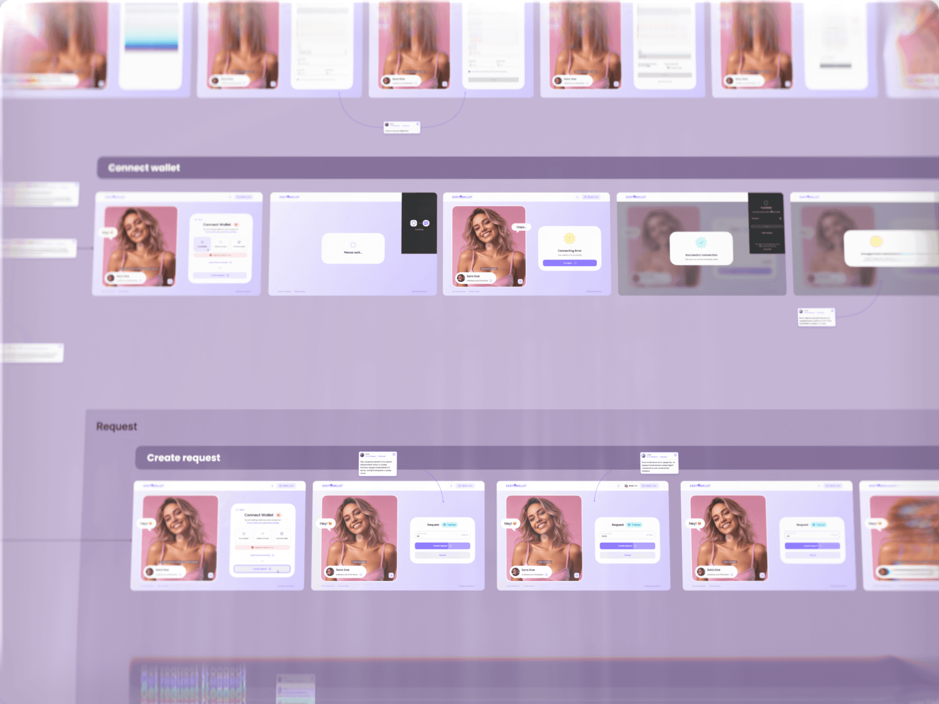
The main desktop flow took shape as a set of prototypes. That gave us a common structure to discuss before we introduced colour, illustration, or motion.
We then developed two visual directions. When the client asked why the concept did not yet show every scenario, including buying crypto, we clarified the distinction: the prototypes covered the product logic; the concept demonstrated the visual language we would apply across it. Keeping those stages clear helped us discuss the right decision at the right time.
Visual Direction



Research
Keep the reason for paying on screen
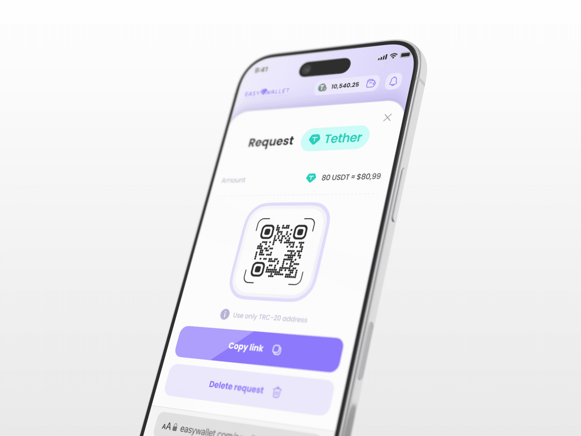
The payment layout put the action in one column and its context in the other. The customer could keep seeing who they were paying and what the payment was for while moving through the process.
That second column also gave the product room to adapt to different merchants. A creator's page could use a portrait and an expressive background. Another business could use a more neutral treatment. The payment controls retained a consistent structure.
We also designed a simple explanation of the money's route: the customer, EasyWallet, and the recipient. Someone arriving from a familiar chat or website was suddenly inside a different service. The interface needed to explain where they were and why this service was part of the payment.
The same thinking continued into the smaller states. The top-up flow showed the choice between a bank card and crypto, including the relevant network and connected wallet. The confirmation used a receipt-like object to make the amount and recipient easy to recognise. Later iterations reduced the technical detail on completion screens to the information the customer actually needed.
The aim was to keep each step connected to the original purchase, even when the mechanics underneath became more complicated.
Competitor Analysis



Design solutions
Design the joins between services
Buying crypto with a bank card depended on an external provider. Identity verification introduced another interface, another set of rules, and another possible break in the flow.
We investigated SumSub and Banxa to understand the experience a customer would encounter: which screens could be styled, where the product would hand over to another service, and what would happen afterwards. While provider decisions were still open, we continued designing the parts of the product that did not depend on them.
Demonstration flows made those questions concrete. In the car-rental scenario, a customer followed a payment link from a chat, uploaded identity documents, took a selfie, supplied a driving licence, and proceeded to payment. We separated the checks into individual steps and placed short video instructions between them. The final action returned the customer to the chat, closing the loop with the merchant.
The retail demonstration had a different shape. A member of staff entered the amount, the customer chose a card or crypto, and the crypto route generated a QR code to scan with a wallet. The terminal then displayed a receipt animation.
These prototypes let us examine the transitions in context. The important design question was what the customer needed to understand at each handover, from the merchant's environment through verification and payment and back again.


Outcome
Let the brand grow with the product
Both visual concepts moved away from the dense, dark appearance associated with crypto tools. The product was intended for people whose main interest was sending or receiving money.
The first direction used dimensional buttons, crystals, coins, soft dividers, and small physical metaphors. The second was flatter and more graphic, with black typography, drawn shadows, patterns, and confetti. The client chose the more dimensional direction.
As the scope widened, the early identity needed another look. Its purple palette and crystal motif had become closely associated with the initial creator-focused scenarios. The product now had to make sense for other kinds of business as well.
The distinction between Wallet and Pay made this more important. Wallet covered balances, transfers, and assets. Pay covered the payment layer, including a scenario where the customer paid by card and the recipient received crypto. They needed a shared identity with enough flexibility to distinguish their roles.
I initially argued for keeping the familiar EasyWallet spelling because it was easy to hear, remember, and search for. Merchant referrals and direct links made that concern less decisive, and the naming exploration continued towards EEZY Wallet.
Later, I rejected the first compact-symbol proposals and asked for another iteration. We needed a square mark that could work as a logo, favicon, and potential app icon. The wallet direction eventually moved towards a more universal symbol, leaving room for Pay to develop a related identity of its own.
Carry the same logic through the whole product
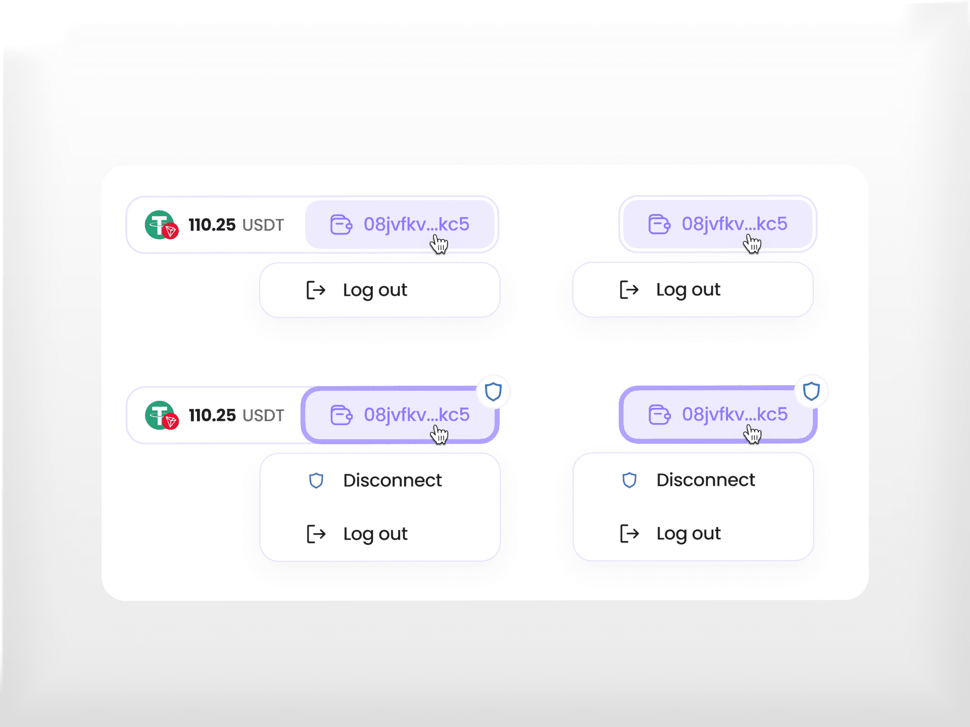
The work extended into the everyday parts of the wallet: balances, top-ups, connected wallets, transaction history, sending funds, notifications, and purchased assets.
For merchants, we prioritised readable figures and short summaries over a dashboard full of charts. The immediate task was to understand the state of the business. Empty states also needed to move the user forward: a wallet without transactions could suggest a first operation; an attempt to send from an empty balance could lead to a top-up.
New requirements changed the order of work. A responsive web version became a priority, followed by a simple NFT view required by a payment partner, before further work on the payment flow and merchant tools. Mobile was a web adaptation of the same product, with its own layouts and states.
By the later stages, the design work covered desktop and mobile interfaces, payment and verification flows, merchant tools, prototypes, presentation demos, and branding. The desktop work had reached a point where developers could begin implementation, with subsequent screen sets reviewed for the same purpose.
That is the scale of the project: a connected set of product decisions, carried from the first rough flows into detailed interfaces. Art direction had to keep those parts coherent while the definition of the product kept changing.