Vibe Skills
A landing page in one take.

Service
Web Design
Branding
Art Direction
Motion Design
Tools used
Figma
Year
2025
Starting with a kit
A course platform that refused the catalog look
2025. AI education platform. Brief said “make us a Skillbox.” I went to buy cigarettes, came back, drew the whole concept in one sitting, and that concept is now the reason three unrelated clients knocked on our door. An American startup, a Swedish fintech, and an American infra company — all from this one landing page.
The kit we never opened
Taras and Sergey were building an online school for vibe coding, vibe prompting, vibe whatever — teaching non-technical people how to actually work with AI instead of just watching YouTube videos about it. Their references were Skillbox and Zegocloud, their brief lived in a Notion doc, and their explicit request was to buy a UI kit and slap a landing page together from it.
We bought the kit. Sigma UI, cheap, decent enough. And then I went to buy cigarettes, came back, sat down, and in a few hours drew a concept that made the kit irrelevant. Everyone looked at what came out, looked at the kit, and decided to eat the extra complexity in exchange for something that didn’t look like it was assembled from a catalog. The kit stayed in the Figma library like a reference book nobody opens after the first week.
This happens with me more than it probably should — I draw most concepts on the first try, not because I’m guessing right, but because fifteen years of projects don’t evaporate when you open a blank file, they sit behind your eyes and answer the brief before your conscious brain has finished parsing the Notion doc. I’ve had projects where the first concept gets torn apart and we iterate for weeks. This wasn’t one of those. The concept landed, Taras approved, and what shipped is what I drew that afternoon with minor adjustments to particle density because Danila thought the original looked like Windows 7 wallpaper, which — fair enough, if you squint and have no taste, I suppose you could see it.
A market of clones
Skillbox was the category default
CIS design is a visual disease
I need to explain something about the CIS online education market, because without this context the design decisions don’t make sense. Skillbox, Practicum, SkillFactory, every platform in this space — they all look the same. Flat vectors, clean in that way where clean actually means empty, a color palette that could belong to any of them because it doesn’t belong to any of them specifically. You could swap their logos and it would take a week for anyone to notice, and that’s being generous.
We told Taras and Sergey this in roughly those words, minus some of the profanity that tends to accompany my design opinions. The pitch was simple: if you build something that looks like Skillbox, you’ll compete with Skillbox on content and price, and you’ll lose, because they have more content and lower prices. If you build something that looks like nothing else in this market, you compete on a dimension where nobody else is playing.
They agreed, partly because the argument made sense and partly because the concept I’d already drawn was sitting right there looking better than anything Skillbox ever shipped.
One afternoon
Draw the direction before the page
The wide-angle trick
We have a style that shows up across our projects — soft lighting, physically correct shadows, materials that feel like they have weight and texture rather than being flat shapes on a screen. For Vibe Skills, that foundation fused with something I’d been wanting to try: cinematic wide-angle perspectives with heavy lens distortion, the kind of shots you see in films where the landscape stretches and bends toward the edges of the frame and everything feels enormous even though the central figure is tiny.
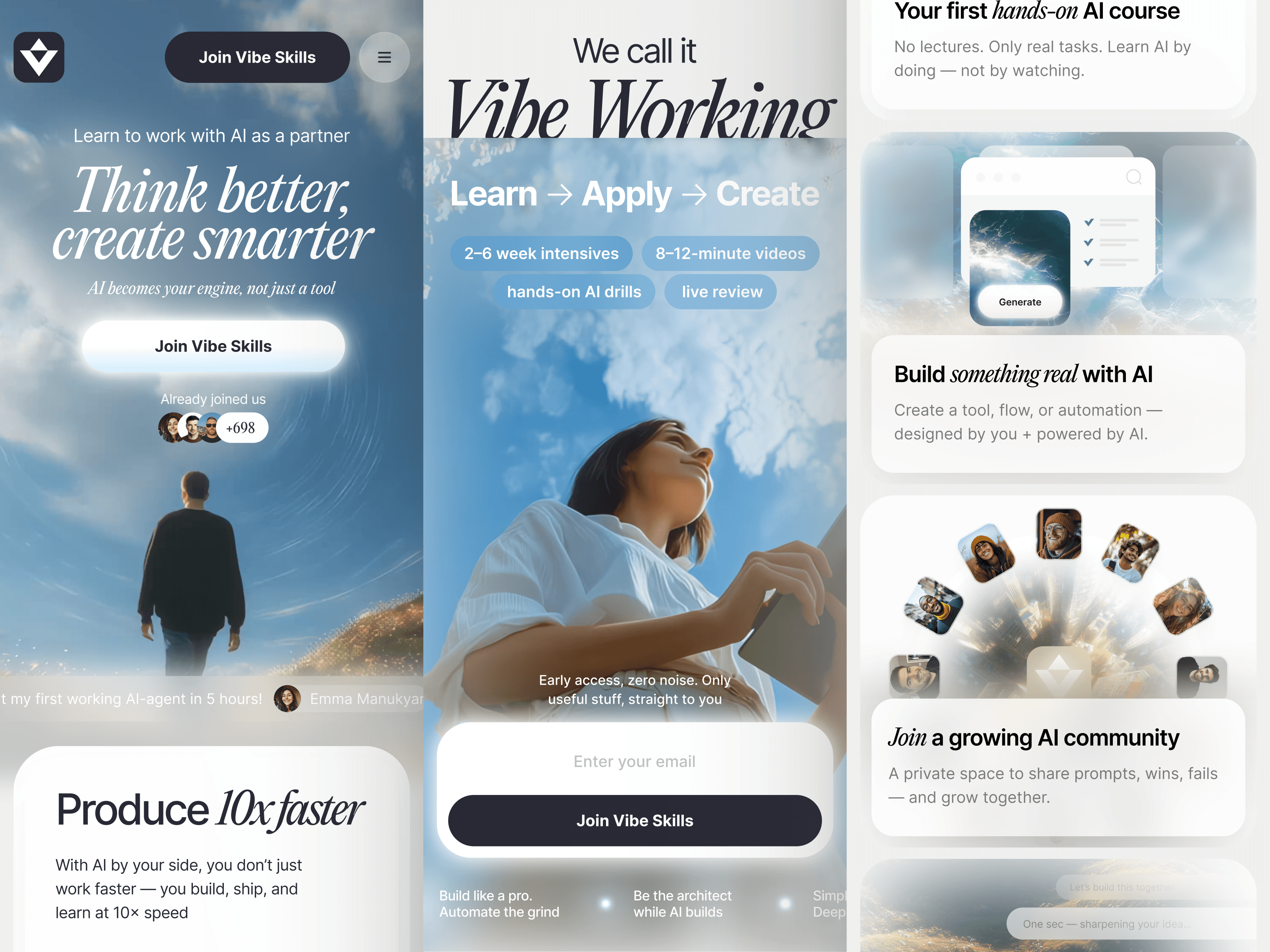
The distortion does something very specific — it makes the scene feel like a place you could walk into, not a banner you’re scrolling past. Low perspective, rolling hills, an enormous open sky, a lone figure walking forward, and these luminous technological particles scattered through the air like data that somehow became visible. The figure is small but sits dead center of the composition, so despite the scale of everything around them, your eye knows exactly where to land.
Perplexity was the closest existing reference point, that sense of intelligence presented through spacious, confident design — but Perplexity goes cosmic and nocturtal, all dark backgrounds and starfields, and we went the opposite direction. Daylight. Earth. Grass under your feet and sky above your head and technology as something that lives in this world rather than replacing it.
The keyframes were generated in Midjourney, because at that point in spring 2025 nothing else could handle compositions this painterly — Nano Bana couldn’t do atmospheric art direction at this level, and Midjourney was still untouchable for this specific kind of imagery. The hero video on the landing page came from Runway, which was the best option for cinematic scenes with depth and atmosphere, while Kling at the time was better for rotating 3D objects and interface animations but would have butchered something like this.
The video has problems that I deliberately left in. Character consistency across scene cuts was shit — we faked our way around it with operator tricks, showing the figure from the back in one shot, close-up in another, never repeating the same angle across separated scenes because that’s exactly where the AI inconsistency would be most visible. Kling 3.0 or Ominni would produce something technically cleaner today, and I could regenerate the whole thing in an afternoon. I won’t. The video is an artifact of what the tools could do in spring 2025, made with those specific constraints, and I think that’s more interesting than a perpetually polished showreel — the same way I didn’t go back and update Roketo’s Midjourney assets when newer versions dropped. The work is the work, made when it was made, with what existed at the time.


A visual argument
The world became the research
Everything else that shipped
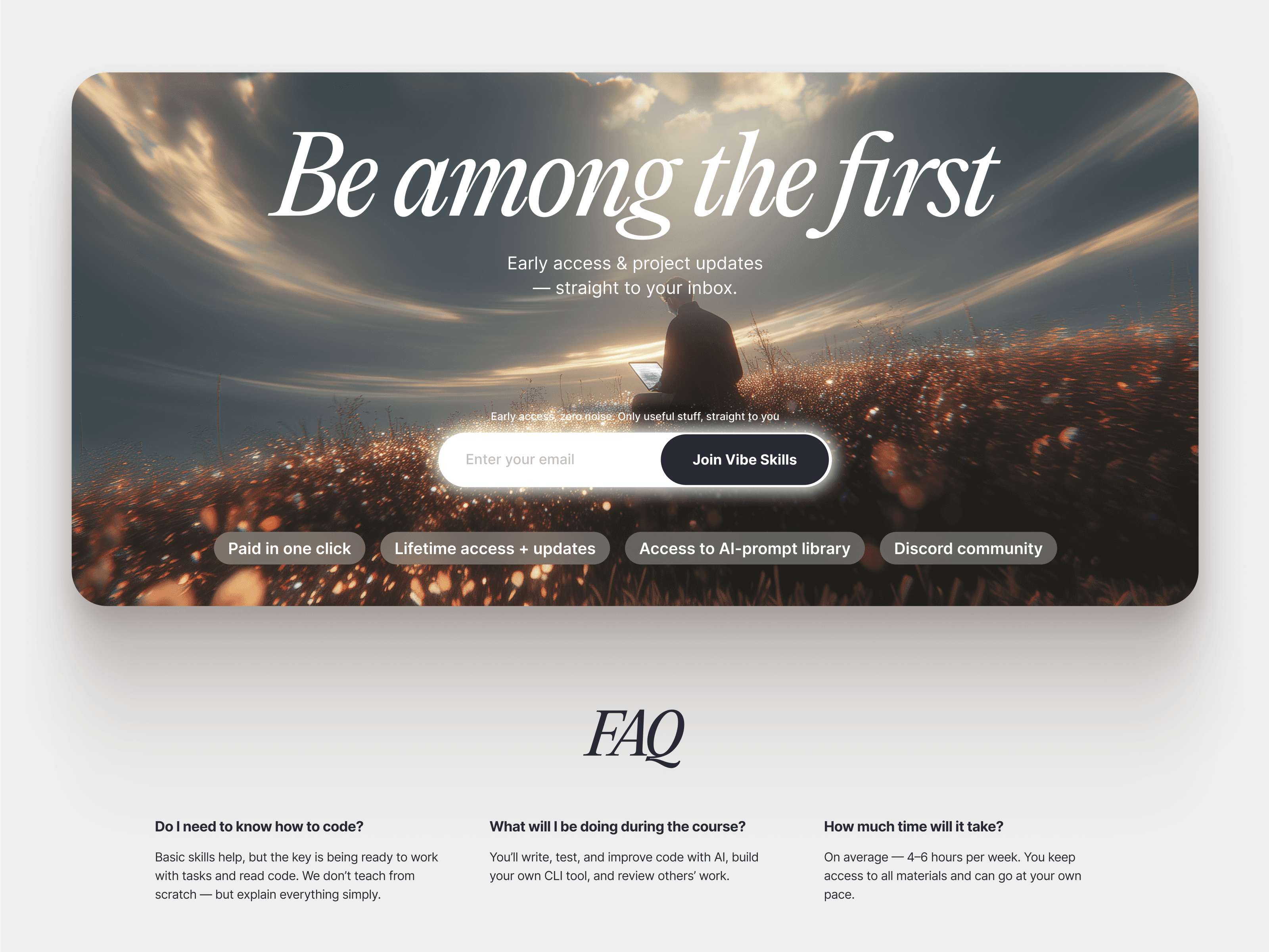
The landing page went to Webflow — our developer built it, which meant we controlled animations and interactions directly instead of writing specifications that a separate dev team would inevitably misinterpret. Hero section with the video, a social proof ticker running early adopter quotes for trust (because when you’re a new platform with no track record, you need something human moving across the screen to compensate), an animated chat widget that simulates a real AI conversation, course cards, pricing.
Marie designed the course page template, and the important decision there was making it deliberately boring. Not visually boring — structured. Content-heavy, text-forward, no parallax bullshit, no scroll-triggered animations that make you wait three seconds to read the next paragraph. People on a course page are there to decide whether to give you money, and the last thing you want is a beautiful animation standing between them and the information they need to make that decision. This is something I keep having to explain to clients who want every page to look like an Awwwards submission — sometimes the most effective design choice is restraint, and course pages are one of those times.
The Russian version got treated as a separate design effort because I refused to let it be a direct translation with Cyrillic swapped in. Different typographic choices, slightly adjusted layouts — the goal was for it to feel like a localized product, not a downgrade. We had a whole argument about whether to write “вайб” in Cyrillic or keep “vibe” in Latin. I pushed for Latin, Sergey pushed for Latin, Danila thought Cyrillic looked like TikTok branding, and in the end Latin won because it reads as a brand name rather than a borrowed word.
We also did their course presentation templates for the actual educational content — slide decks that students would sit through — and this was a small scope addition that mattered more than it looked on paper, because if the website feels like one brand and the course materials feel like a different one, the whole experience fractures. Spacing, hierarchy, consistent use of the type system, consistent visual language in the illustrations. A student should feel like they’re inside the same world from the moment they hit the landing page to the moment they’re watching a lecture, and that continuity is built from unglamorous decisions about margins and font weights that nobody notices unless you get them wrong.


A brand that travels
One system from landing to lesson
The first mark
First round of logos: rejected, completely. Sergey’s exact words were something like “nothing clicked,” and the team wanted a mark that would work in a square format for social avatars and icons. Fair request, and the first batch didn’t answer it.
Second round came the next day — new directions, new geometry, and they picked the final mark immediately. It’s a faceted diamond shape that reads as a V, works on any background, scales down to a favicon without losing legibility, and has this quality of dimensionality without being literally 3D, like a gem cut from light rather than modeled in Cinema 4D. That last part matters because the whole visual language of the project sits in this space between flat and three-dimensional — things that feel physical, have weight and light interaction, but aren’t rendered objects. The logo had to live in that same uncanny middle ground or it would have looked like it belonged to a different brand.
Inter meets Editorial
Inter for body and headlines, PP Editorial New Italic for accents and display. The serif italic against the clean geometric sans-serif does something I still find genuinely hard to articulate — it feels editorial and technological at the same time, like a magazine about the future written by people who actually live there rather than people speculating about it from 2019.
This specific pairing is what caught the Swedish fintech. They found us through this project, and these are not playful people — bank-adjacent, regulation-heavy, the kind of company where you’d expect them to want Helvetica and navy blue and nothing that could possibly offend a compliance officer. Instead, they wanted what we did with the typography on Vibe Skills, that same energy, applied to their product. The American startup came through the same door, and most recently an American infrastructure company — all three saw this project and decided they wanted to work with whoever made it.
I keep thinking about the Sigma UI kit sitting unused in that Figma library. It would have been faster. It would have been cheaper. And nobody would have come looking for us afterward, because a landing page assembled from a kit looks like a landing page assembled from a kit, and the world has enough of those.



The door it opened
A three-week concept became a door
The three-week artifact
Brief to shipped website: about three weeks, including the landing page, course page template, brand guidelines, logo, Webflow build, and presentation templates. The concept that drives all of it was drawn in a single sitting on a single afternoon.
I don’t think this is a story about speed, even though the speed is the most visible part of it. It’s a story about what sits behind the speed — every project before this one, every visual decision that worked and every one that didn’t, every argument about typography and every time a client said “nothing clicked” and I went back and drew something better the next day. All of that is in the room when I open a new file, and sometimes the brief hits it at exactly the right angle and the whole thing comes out in one take.
This was one of those times.


