Product Design
Designing a crypto onboarding flow
Behind the UX architecture of BlastUP's IDO flow: onboarding, wallet connection, staking, and the structural decisions that reduced drop-off by 40%.

2024. A Notion doc with two pages of solid text. A staking flow with more branching logic than anyone expected. 40% less users bailing halfway through. The UI took a day and a half. Everything else took weeks.
How it got to us
BlastUP had designers. Working product, live economy, everything functional. But the co-founder knew us, and specifically knew that the kind of problem he had — structurally complex, full of technical constraints that create UX dead ends — was the thing we're unreasonably good at.
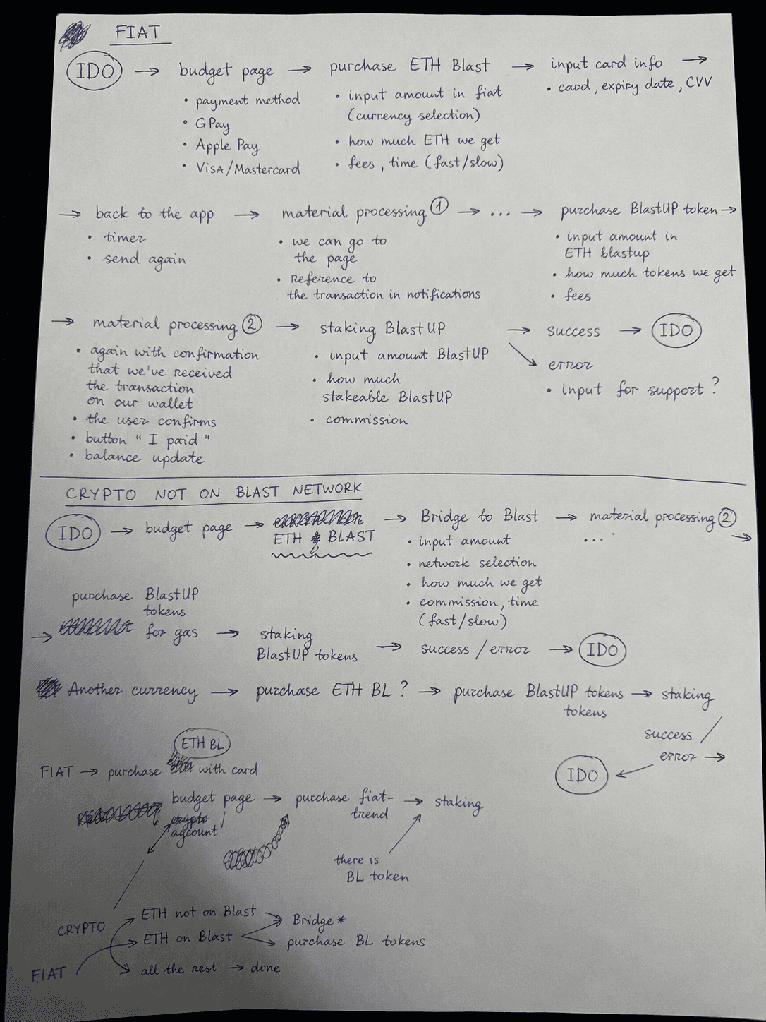
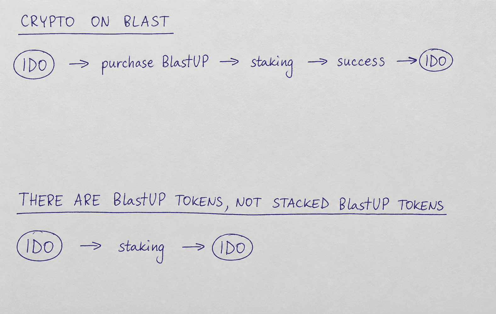
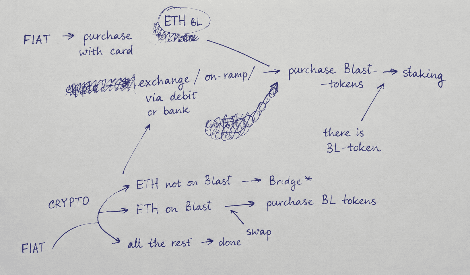
Road to IDO: a flow that takes a user from knowing nothing to having staked tokens and an IDO allocation, through wallet connections, a tier system nobody's heard of, a choice between fiat and crypto payments, gas fees that technically have to be a separate transaction, and a third-party payment widget that looks like it might be a scam if you don't frame it right. The brief was a Notion document. Two pages of continuous text explaining how it works under the hood. No states, no edge cases, no UX thinking whatsoever. That was it, that was the whole thing, everything else was our problem.
Stealing from ourselves
There's a curly little arrow — decorative, does a little loop before pointing at something — that was first drawn by Vlad Pochukalin, the founder of a studio I used to work at. I liked it, used it in another project, then another, and it's been migrating from file to file for four years now. It's not that I'm copying an arrow. It's that every project deposits things into a shared library — patterns, components, micro-decisions — and over time that library becomes the reason we work fast, because half the thinking on any new project has already been done somewhere else.
For BlastUP, the deposit that mattered was from EZ Wallet. Den — one of our guys — had built an onboarding architecture for it that was, and I don't say this about many things, genuinely brilliant. Left side of the screen: dynamic contextual guidance that changes with every step. Right side: the actual actions. The user is never sat down and taught.
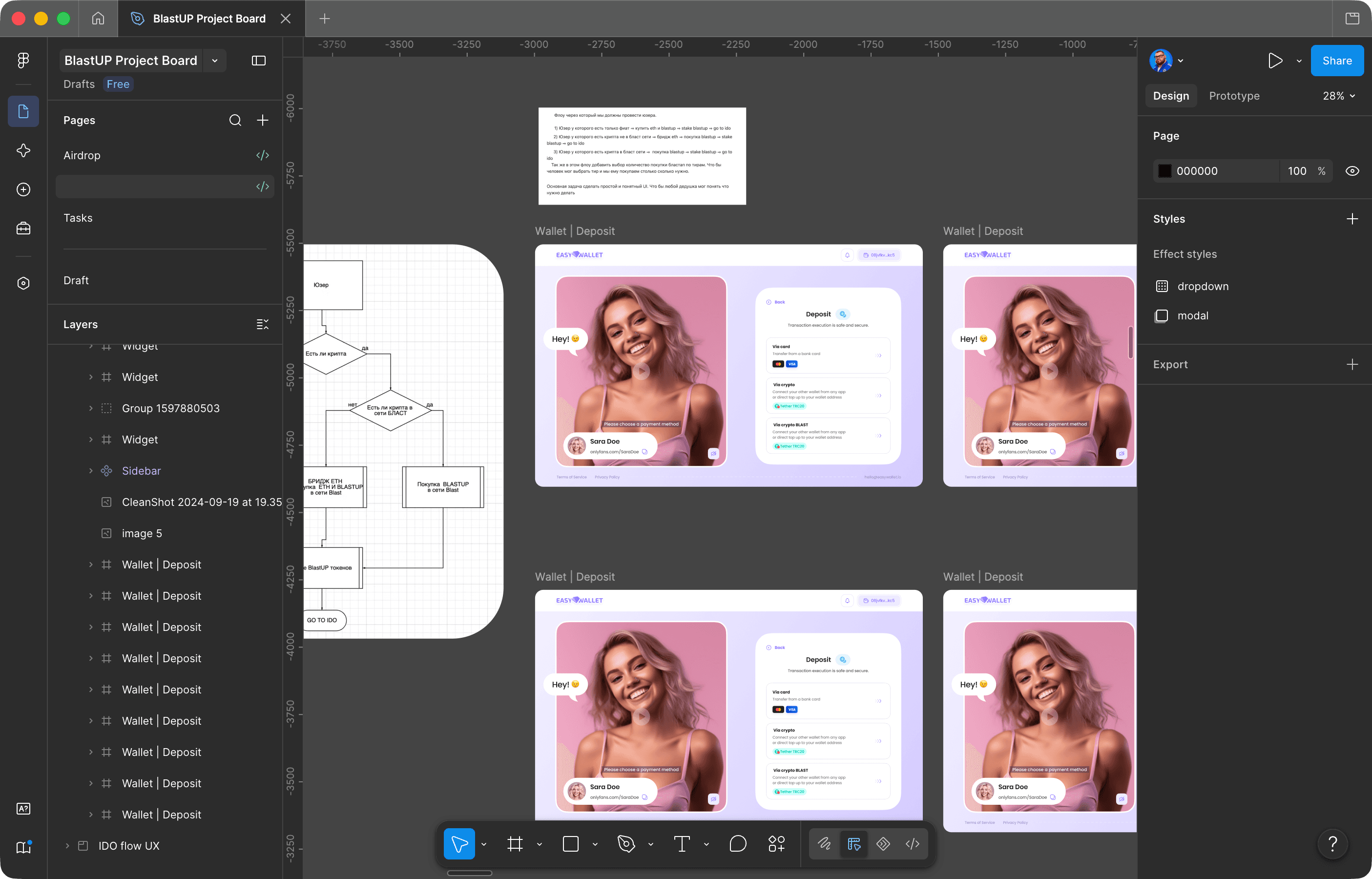
They're doing things and being guided simultaneously, and the seam between learning and doing doesn't exist. We didn't copy the screens. We took the idea that onboarding and participation should be the same thing, and rebuilt it from scratch for a completely different product.
The part that was actually hard
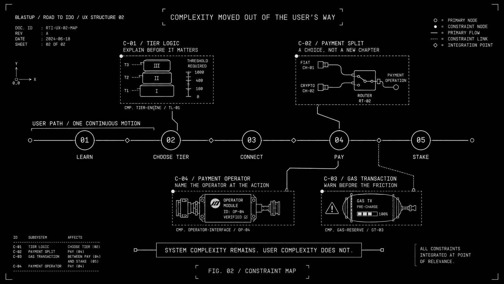
Normally we don't need three weeks to think about UX on a crypto product. We've shipped enough of them that we could spec an NFT marketplace flow at three in the morning if someone shook us awake. The UX on most of these things is, frankly, trivial — the visual layer is where the actual craft lives.

BlastUP was the inverse, and that's what makes it worth telling. The visual layer came together in about a day and a half. The flow logic — the invisible part — took weeks, and it took weeks because every path through the system branched into states we hadn't anticipated, and every state we missed was a user hitting a wall with money already committed.
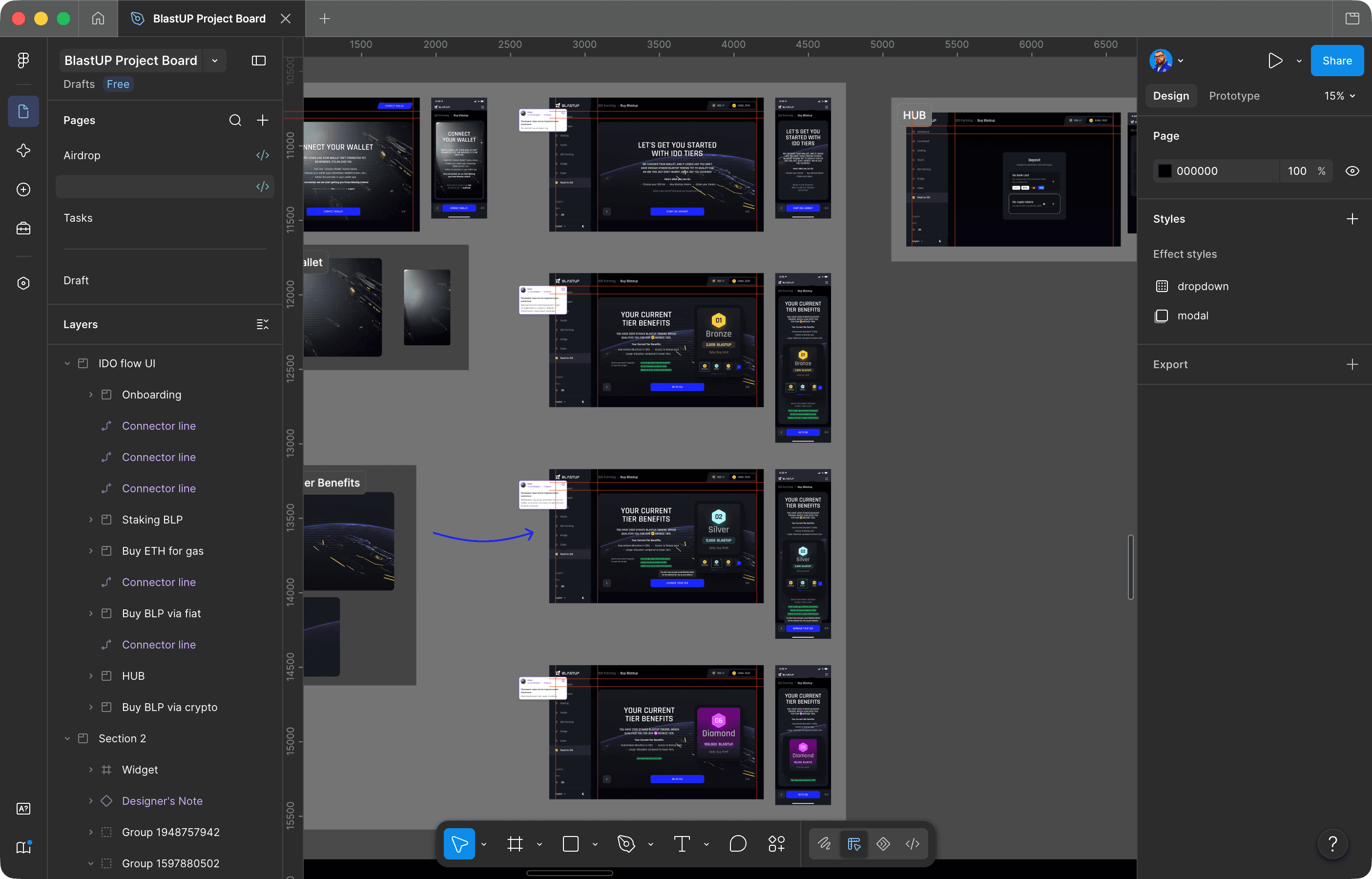
Marie and I started by building something that looked, and I want to be precise here, like garbage. There were pieces from Kibra in it, pieces from NearWallet, chunks of Untitled UI from a kit we'd bought, elements from the Münzen widget — visually, a complete Frankenstein. But the structure underneath worked. Marie went through every screen sticking in comments — not design annotations, more like dispatches: here's what this element does, here's why it's here, here's what breaks if you remove it. We showed this beautiful disaster to the client, they approved the logic, and only then did we start making it look like something.
The process was: write down every piece of information that could conceivably appear on every screen in every state. Then remove things. Then remove more things. Then take what's left and find shorter ways to say it.
The split between me and Marie: early-stage architecture was maybe 70/30 my direction. Mid-stage prototyping and the entire UI flipped heavily toward Marie. She built most of what shipped. I reviewed, redirected, caught inconsistencies. She's not an assistant on these projects. She's a co-author, and this specific project wouldn't exist without her.
Five clicks to irreversibility
The thing that cut drop-off by 40% is hard to point at, because it's not a feature — it's a structural choice about where one thing ends and another begins. Or rather, the choice to not have that boundary at all.
Standard flow: onboarding ends, real flow starts, user connects wallet, user begins participation. The problem is that the gap between "onboarding ends" and "real flow starts" is where most people leave. It's a natural exit point — I've learned enough, I'll come back later, maybe.
What we built: five steps. First three are clearly onboarding — here's how tiers work, here's what allocation means, here are the UI elements you'll see later, introduced now with text so they're already familiar when they show up for real. You click "Let's go." Then "Great." Then "Got it."
Step four looks like onboarding. Same layout, same pacing, same position for the button. It is not onboarding. You are now technically in the IDO participation flow. Step five: "Connect wallet" appears in the exact spot your thumb has been tapping for four screens.
Nobody decides to participate. They just never encounter a moment that asks them to decide.

The modal that keeps its mouth shut
After you connect your wallet, you choose how to pay — fiat or crypto. This shows up as a modal overlay, not a full page. This was a very deliberate, very small decision that I still think about.
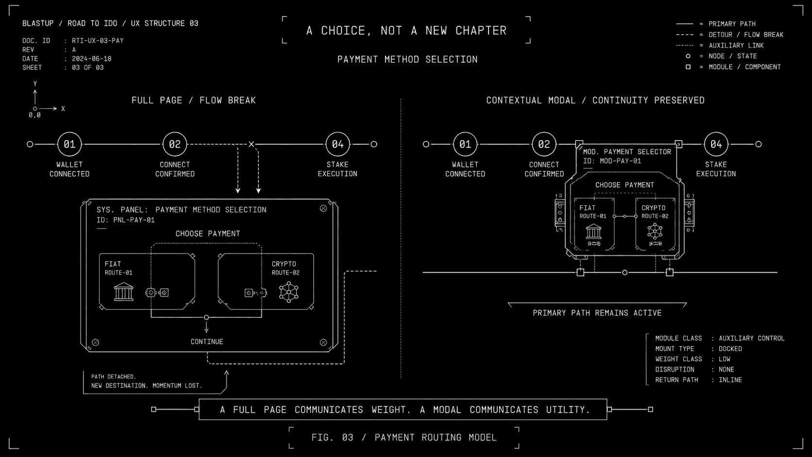
A full page communicates weight. It says: here is a significant decision, please pause. A modal communicates utility — quick thing, pick one, move on. At this point the user has already connected their wallet and tapped through four screens of forward motion. The last thing you want is a layout that whispers "maybe stop and think about whether you really want to do this."
The tier upsell operates on the same principle. On every relevant screen: what your current tier gets you, what the next tier would get you, and exactly how much more you'd need — calculated live from your existing staked balance, converted to fiat via API, shown right there in context. Not a popup. Not an interruption. Information that belongs where the user is already looking, arriving at the moment they're already thinking about it.
The gas fee step — technically forced, a constraint we couldn't remove — became part of the same rhythm. Pre-warning on the screen before. The gas screen itself explains what you're paying for. Everything presented as context for the step you're on, never as a pitch for a step you haven't chosen.
Surfaces
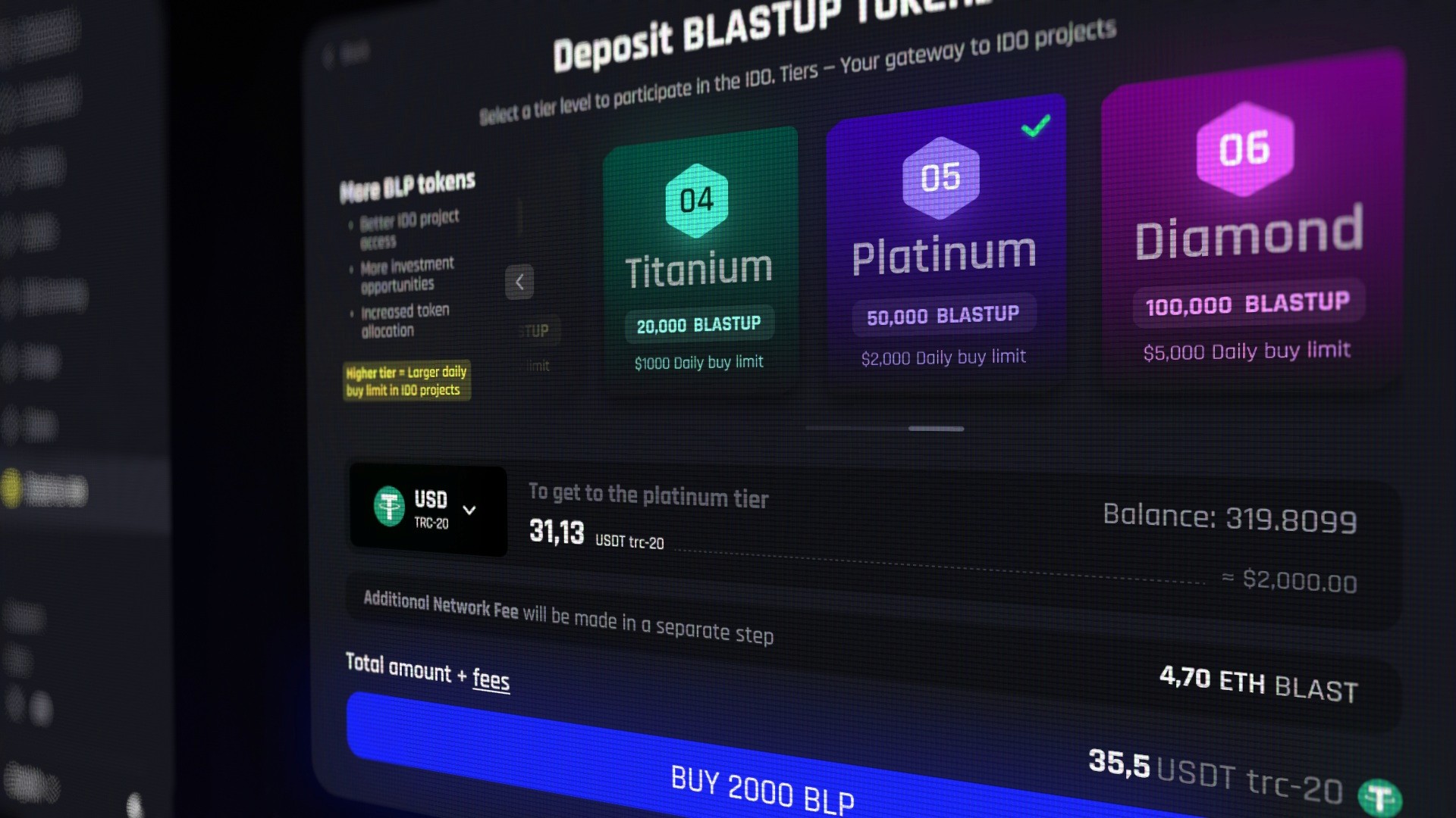
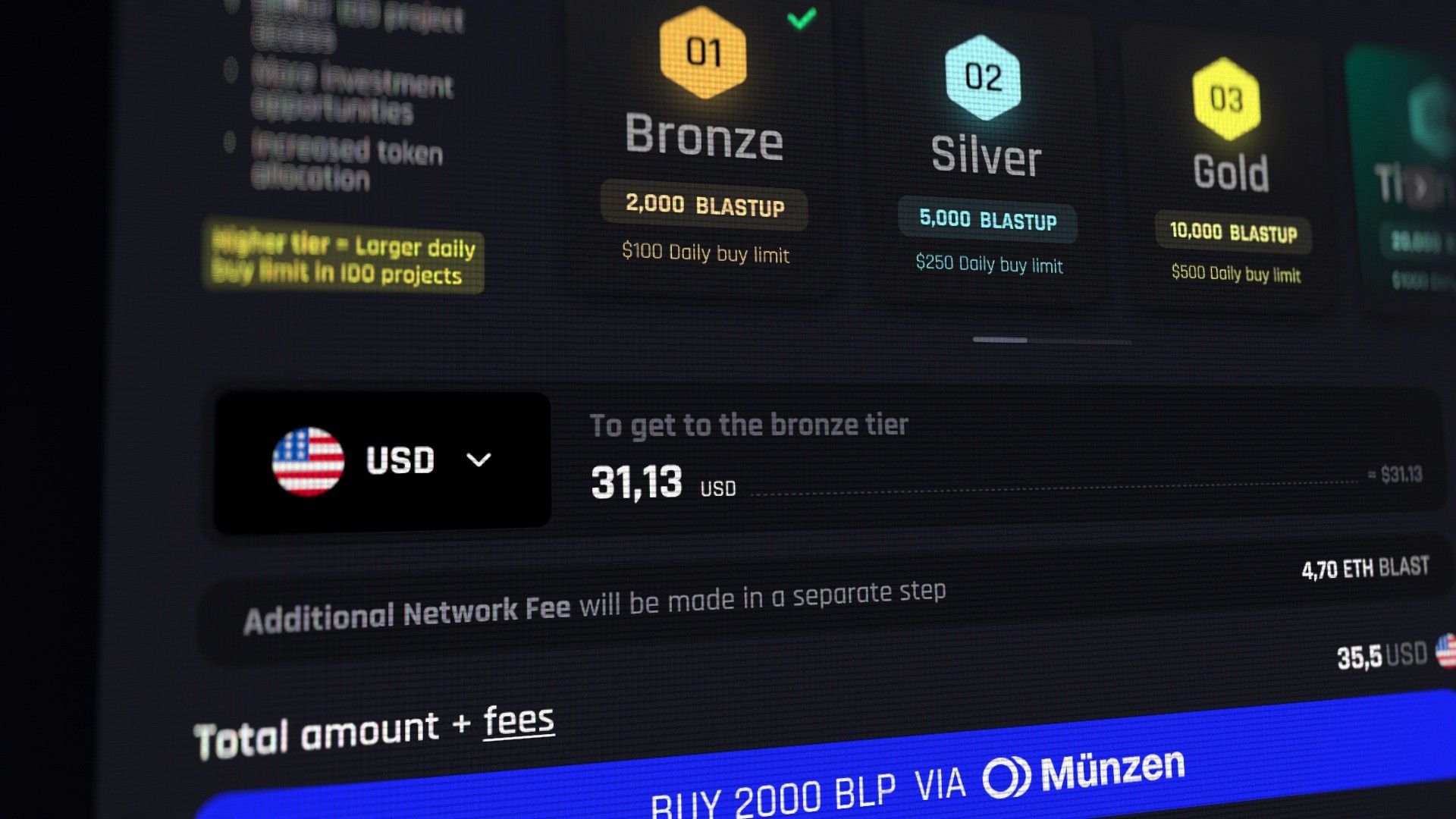
The cyberpunk glow and volumetric tier cards, the shadows that make them feel like physical objects you're picking up rather than flat images you're selecting, the payment operator logo embedded directly in the action button so you know who's processing your money before you tap — all of this is real craft, and all of it affects conversion. In crypto, visual confidence is spending confidence.
But it was a day and a half of work on top of weeks of structural thinking, and I think that ratio — not the screens themselves — is the thing worth remembering about this project. The product that shipped looks clean and professional and glowy. The product that actually works, the one that reduced drop-off by 40%, is invisible. It's the architecture underneath — which screen comes when, what information lives where, which moment feels like a pause and which feels like momentum, and the precise point at which onboarding stops being onboarding and starts being the thing itself, which is a point that, if we did our job right, nobody can find.