
Product Design
The button was too easy
A crypto trading product had healthy engagement, but users stopped when serious money entered the flow.

There is a specific kind of product problem that produces excellent dashboards and uncomfortable meetings at the same time. People open the app regularly, spend a respectable amount of time inside it, save things for later, complete small transactions, and generally behave like users of a product that works. Then the amount of money involved becomes meaningful, the same people suddenly slow down, and the team starts discussing button copy because the button is the last visible object before the numbers fall apart and the cheapest one to interrogate. This case began with that familiar setup, although the button turned out to be almost entirely innocent and had mainly suffered from being the only suspect everybody could fit into a sprint.
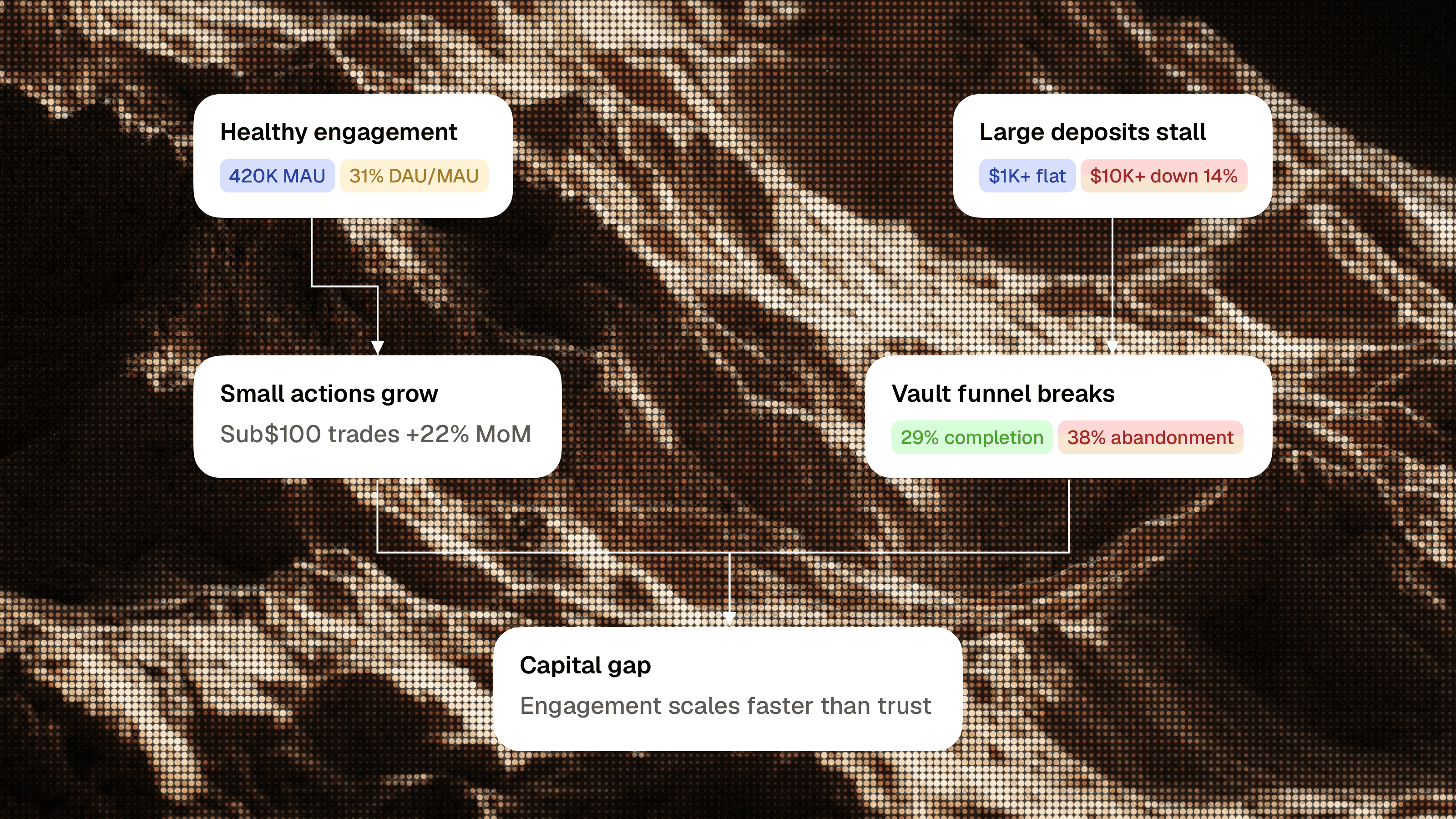
The product was a retail crypto trading platform with a strong, lively interface and a growing audience. Monthly active users had reached 420,000, DAU/MAU was 31%, the average session lasted 11 minutes and 40 seconds, and 54% of users maintained a watchlist. Small trades below $100 were growing by 22% month over month, while ordinary trade completion sat at 71%. Those numbers described a product with healthy engagement and users who understood enough to explore, compare, return, and move smaller amounts of money through the system.
The picture changed when they reached vault deposits. Deposits above $1,000 had stopped growing, deposits above $10,000 were down 14%, vault completion was only 29%, and 38% of users abandoned at the final confirmation screen. Usability sessions made the situation more confusing because participants could explain the screen perfectly well. They saw the amount, understood the network, recognized the fee, noticed the estimated APY and risk badge, and knew exactly which button would complete the deposit. The interface passed the usual clarity test while failing the only test that mattered commercially: users understood the action and remained unwilling to take it.
This composite product case uses the supplied data to examine behavior familiar from years of working around crypto, fintech, gaming, and products where a cheerful interface eventually asks somebody to risk something real. I am interested in it because it demonstrates how quickly a design conversation becomes too small for the product problem in front of it. A tooltip, a larger warning, or a more serious button might improve one screen, while the underlying system would continue asking users to perform their own due diligence outside the product.
The Screen Worked
Teams often treat clarity as a single property, although financial products need at least two different kinds of clarity. Mechanical clarity tells a user what a button will do, where funds will move, which network will process the transaction, and what fee will be charged. Decision clarity helps the same user judge whether moving this amount into this strategy makes sense given the source of yield, the range of possible outcomes, the exit conditions, and the risks that remain with the user. The final screen in this product had enough mechanical clarity to perform well in moderated testing, while decision clarity had been left to the user.
That distinction matters because a usability test usually creates an artificial calm around the action. The participant sits in a controlled environment, follows a scenario, explains visible information, and demonstrates that they understand the interface. Real capital introduces a much less polite set of conditions. The user may be moving a meaningful part of their wallet balance into an unfamiliar strategy, through an unchecked contract, for an estimated return that can change after the transaction. The screen can remain perfectly legible throughout this process and still fail to support the decision being made.
The team had effectively designed a transaction confirmation and placed it where users needed an allocation review. A transaction confirmation verifies that the amount, destination, network, fee, and final action are correct. An allocation review gives the user a structured way to understand what drives the return, what can change, how they can exit, what happens after confirmation, and whether the strategy suits the way they intend to use the money. Combining those jobs into a compact final screen creates an interface that looks efficient in Figma, where every financial decision is wonderfully calm and nobody has ever lost money, and feels strangely underweight when somebody reaches it with $5,000.
This is where traditional UX criticism tends to become decorative. A reviewer can point at a small risk badge, an unclear APY label, or a weak hierarchy and produce several valid recommendations, yet the user still arrives at the same point before completing the intellectual work required for the deposit. The architectural gap sits across the entire journey, beginning on the strategy page and continuing through amount entry, review, confirmation, and the state after the transaction has been submitted.
The Interface Had One Emotional Setting
Retail crypto products need energy because a completely restrained interface tends to become a spreadsheet with a wallet connection, which may satisfy people who already know exactly what they want while doing very little for everyone else. Color, movement, compact cards, watchlists, fast comparisons, and visible opportunities help users explore a complicated market with the ease of a consumer product. The product in this case was good at that part, and preserving its character was a core constraint for the redesign.
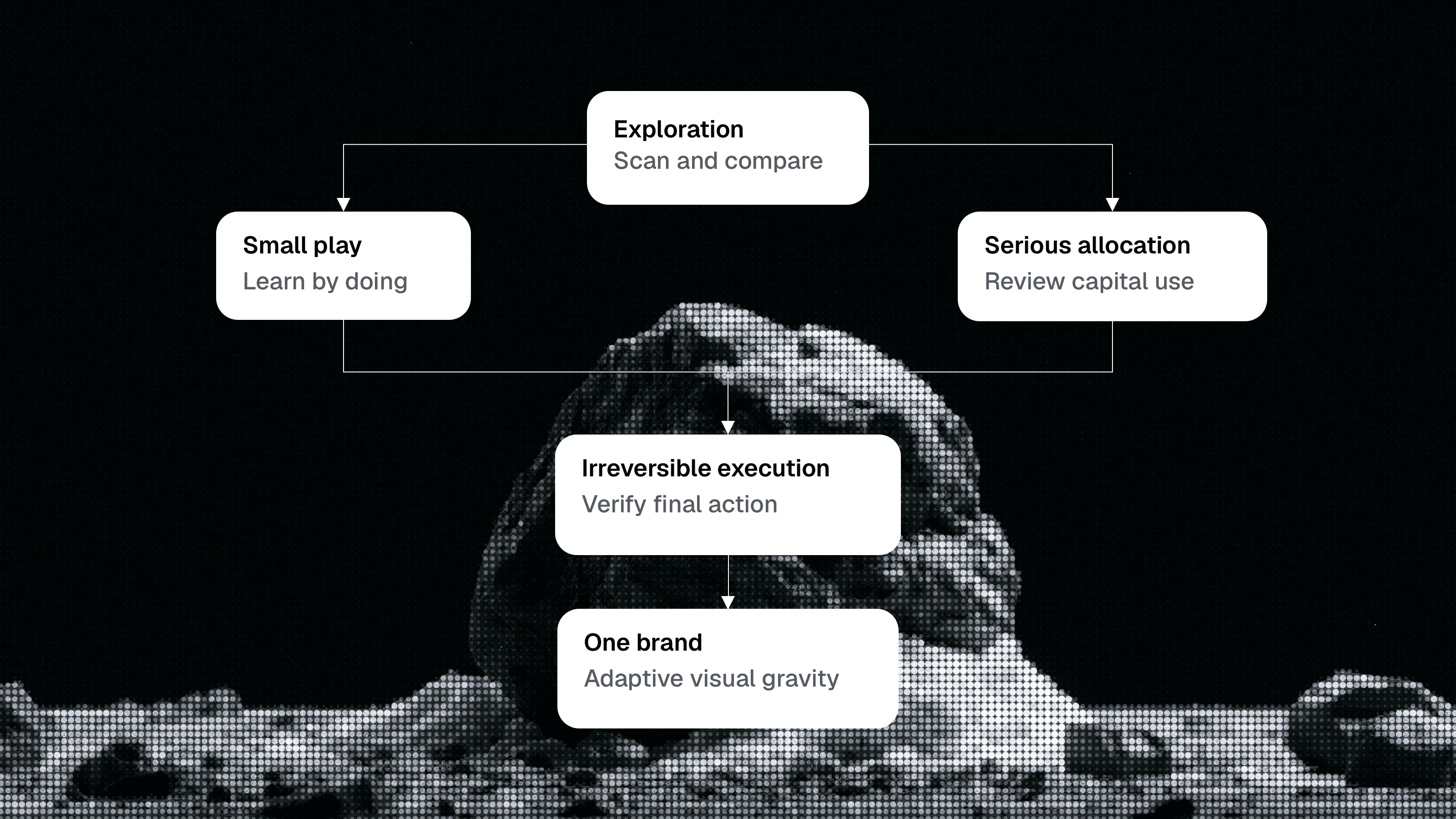
The issue appeared because the same emotional language continued across several very different modes of behavior. Exploration is lightweight and reversible; the user scans markets, opens strategies, saves a few options, and builds a rough understanding of what is available. Small trading is also relatively forgiving; somebody moving $30 or $50 usually wants a fast path that lets them learn by doing. Serious allocation changes the relationship because the amount has become meaningful and the user starts evaluating concentration, yield stability, liquidity, and exit conditions. Irreversible execution has even less room for ambiguity because the user is about to sign and send a transaction that remains final after the interface completes its part.
Those modes can live inside one product and carry different levels of visual gravity. A $50 trade and a $5,000 vault deposit can share components, brand colors, typography, and interaction patterns while adapting the emphasis of the interface. The amount should become more prominent, promotional language should recede, APY should gain context, risk should become specific, and the final action should describe exactly what will happen. A sufficiently flexible visual system can express both playful discovery and high-consequence execution as parts of the same brand.
iGaming products provide a useful parallel because mature operators have spent years learning to express excitement and consequence at different levels of intensity. The lobby is allowed to be loud, fast, promotional, and packed with movement because its job is discovery. Deposit limits, withdrawals, identity checks, and responsible gaming controls require a calmer and more explicit language because the user is managing money or setting boundaries. The strongest products preserve the brand across those modes and give a withdrawal screen the composure appropriate to its job. Crypto often borrows the visual energy of iGaming while skipping the operational maturity that tells the interface when to calm down.
Experienced Users Were Slower
The strongest behavioral clue was that experienced DeFi users hesitated more than less experienced users. A complexity-driven abandonment pattern would usually show experienced users moving faster because they already understood vaults, networks, contracts, liquidity, fees, and variable APY. Their caution showed that expertise was creating additional checks and revealing more uncertainty. They could see everything the interface had compressed into a tidy card, including the conditions that might make the headline return temporary or the exit more complicated than the product suggested.
A novice can move quickly because the visible flow feels clear and several important questions remain outside their current mental model. An experienced user may pause because the APY depends on incentives, the risk level lacks a visible methodology, the strategy has limited liquidity, the contract deserves verification, or the exit conditions matter more than the current return. If the product measures speed and completion separately from the outcomes that follow, novice confidence can look healthier than informed caution. That produces one of the more dangerous analytics mistakes in financial products: the team celebrates the user who understood less because that user clicked faster, which is a surprisingly common way to turn ignorance into a conversion rate.
Support data usually exposes this mistake later. A fast confirmation followed by a confused ticket, an immediate withdrawal, or a complaint about a changing APY represents a weak conversion even if it improved the funnel on the day of the transaction. Experienced-user hesitation can be commercially valuable because it shows the standard of evidence required for a user who understands the category to proceed comfortably. Treating those users as unusually difficult removes a useful source of product intelligence and leaves the product tuned for people still learning what can go wrong.
I would use experienced users as a trust benchmark and study their behavior to reveal which questions deserve first-class product support and which pieces of information currently exist only in documentation, support conversations, block explorers, or external research. The resulting system would give due diligence a clear path, use progressive disclosure for technical depth, and let users decide how deeply they need to inspect before committing capital.
Users Had Already Designed Their Own Flow
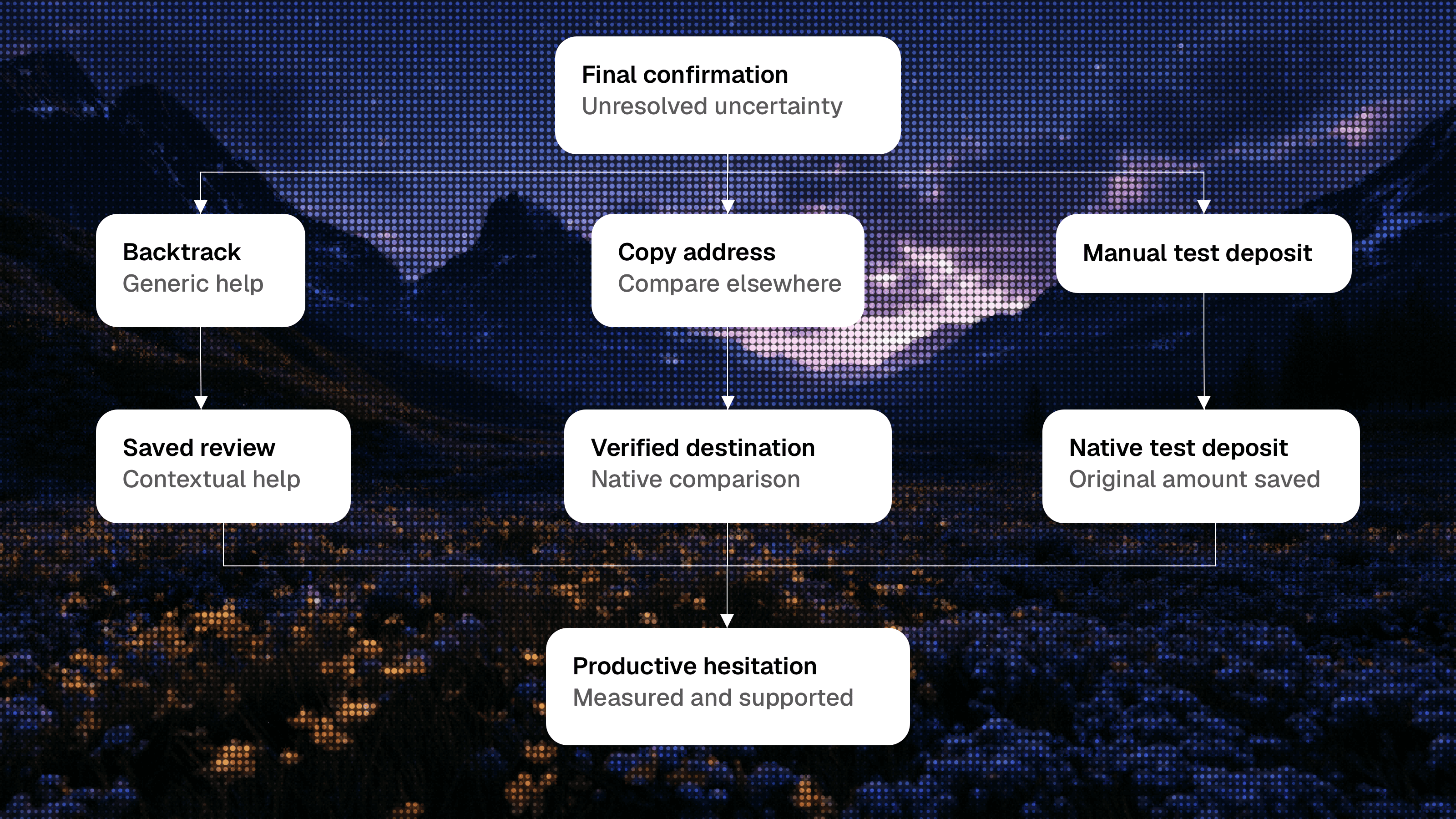
As the intended deposit amount increased, users became more likely to go back, open help, copy an address, reduce the amount, perform a small test deposit, cancel a wallet signature, or leave to compare the strategy elsewhere. A conventional funnel labels most of this behavior as leakage because the user moved away from the shortest route to completion. That label is technically correct and strategically useless. The actions form a coherent safety process that currently lives outside the official product flow.
Going back often means rebuilding the context of the decision after the final screen compressed it. Opening help at the last moment usually signals a specific unresolved concern. Copying an address can mean checking the destination, contract, custody model, or network through an explorer. A test deposit is frequently a high-intent action from somebody who wants to verify execution before sending the planned amount. External comparison shows that the user wants an impartial reference point for APY, risk, fees, liquidity, or exit terms.
The team was worried that adding friction would slow users down, while the data showed that users were already slowing themselves down in ways the product could barely observe or support. They were opening competitor tabs, searching documentation, manually changing amounts, checking explorers, and contacting support, which is a fairly expensive way to admit the product forgot the checklist. This form of friction damages confidence because the user has to invent the process, and it damages the business because the product loses visibility at the moment of highest intent. Removing every pause would be reckless; bringing useful pauses into the product would make the experience easier to understand and much easier to improve.
The product response should convert each unofficial safety behavior into a supported path, with backtracking preserving the review state and contextual help connecting directly to the selected vault, amount, network, and risk profile. Address copying gains a verified destination, a plain explanation, and a direct explorer link. A manual test deposit becomes an official option that remembers the original intended amount. External comparison becomes a product comparison layer that openly shows similar strategies, return ranges, risk dimensions, fees, liquidity, and exit conditions.
APY Was Doing The Wrong Job
APY is unusually easy to turn into a prize. It fits neatly into a large number, supports sorting and comparison, looks good in a card, and gives the visual system an obvious object to emphasize. In a lively interface, the number quickly acquires the emotional role of a bonus multiplier or a jackpot even when the label says estimated. Users may understand intellectually that the return can change while still reading the design as an invitation to act before the opportunity disappears.
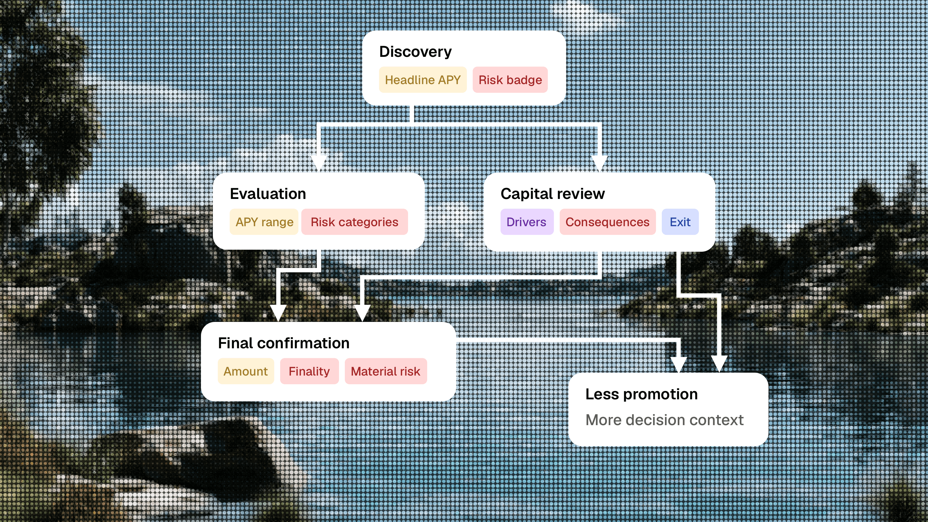
Discovery needs a headline APY because users require a quick way to scan opportunities. The presentation should change as the user moves closer to execution. On a strategy page, APY needs a range, timestamp, source of yield, incentive component, fee assumptions, and a clear description of what can reduce it. During capital review, the number should behave like a financial estimate with supporting context. On final confirmation, the amount, destination, and finality deserve greater visual weight.
A credible APY module could explain that the current estimate is 12.4%, that the strategy ranged between 8.1% and 15.7% over the previous 30 days, and that liquidity incentives, pool activity, and market volatility are the main drivers. A compact decision module can communicate this context clearly and give the estimate an appropriate level of visual prominence.
Risk had suffered from the same compression. A low, medium, or high badge can be useful while scanning a list, while a useful risk module identifies the two or three material risks, describes the practical consequence, explains the exit implication, and defines the limits of the platform's guarantees. A medium-risk badge remains available as the summary, while the underlying system performs actual decision work.
The art direction here needs controlled range. Serious financial information benefits from hierarchy, calm contrast, precise language, and fewer celebratory signals around the final action. Brand character survives this change because a brand with only one volume setting behaves like a style preset, and style presets have a poor record with other people's money.
The Product Needed A Rules Engine For Trust
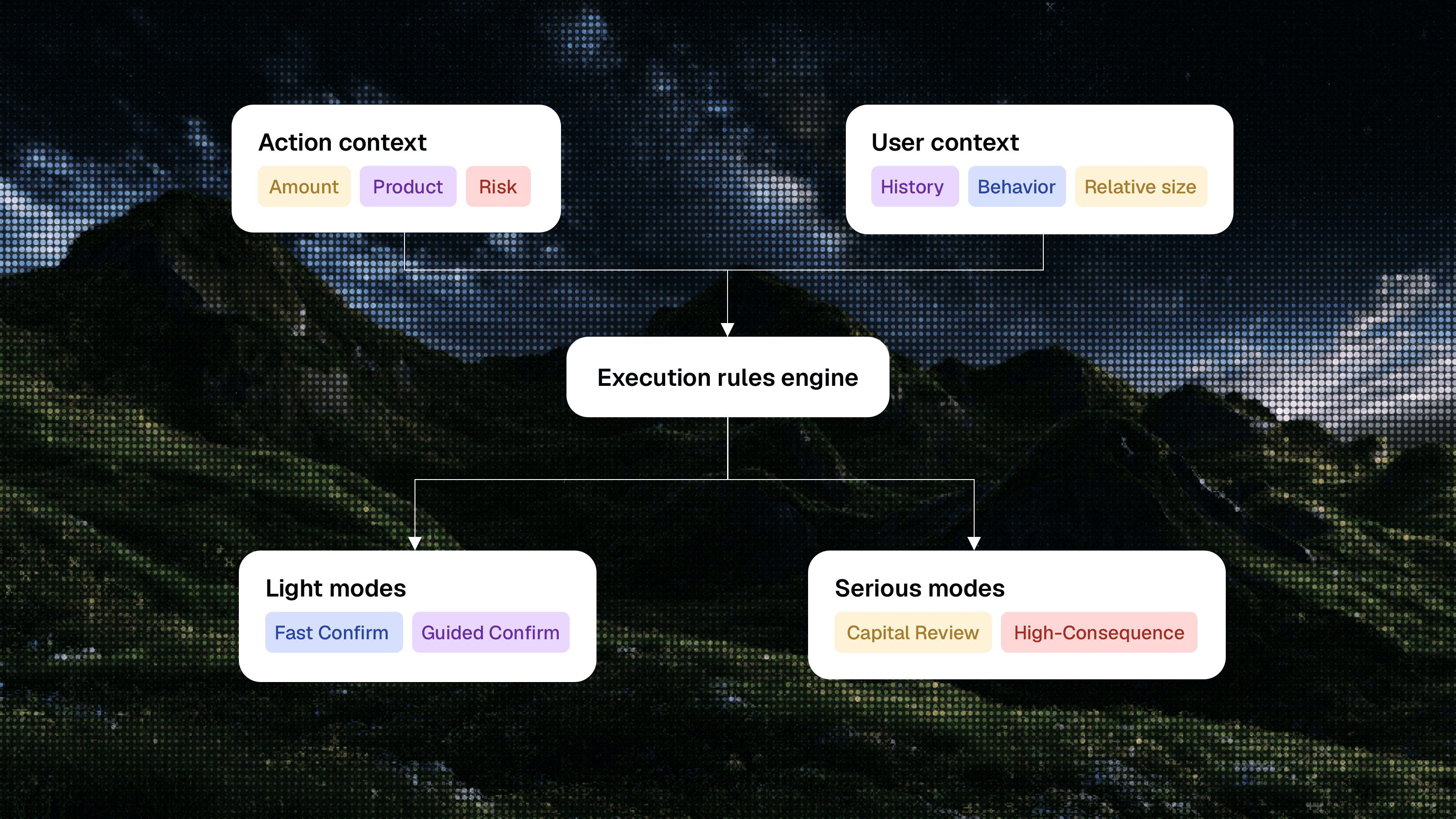
A universal review screen for every deposit would create a new problem immediately. Somebody repeating a familiar low-risk action with an amount well within their normal behavior deserves a lighter flow than a first-time user moving half of a visible wallet balance into an unfamiliar vault. Absolute amount matters, although relative amount, product type, strategy risk, user history, and current behavior often matter more. A static threshold such as "$1,000 always requires review" would become clumsy as soon as real users reached it.
The execution system should combine several inputs. It needs the absolute amount and the amount relative to the connected wallet balance, previous transactions, and the user's normal behavior. It needs to understand whether the action involves spot trading, staking, a liquidity pool, a vault, or a structured product. It needs the strategy risk profile, including liquidity, lock-up, incentive dependence, and experimental status. It also needs user-state signals such as first vault deposit, prior large deposit, experience proxy, support history, and hesitation during the current session.
Those inputs can produce four practical execution modes. Fast confirm serves small or familiar actions with a clear amount, fee, network, and precise action. Guided confirm adds a compact strategy summary, top risks, exit hint, and contextual help for first-time or mildly risky actions. Capital review supports serious allocation with APY assumptions, risk anatomy, exit conditions, a saved decision state, and an optional test deposit. High-consequence execution handles unusually large, complex, locked, or risky actions through a two-stage review, verified destination, explicit finality, and stronger post-confirmation monitoring.
This is the design-engineering part that disappears when a case study presents only polished screens. The visible interface depends on thresholds, states, events, component variations, content rules, and data that may be incomplete or unavailable. Designing the conditions alongside the review page turns a static concept into a working product. The real output is a system that knows when to stay out of the way, when to offer support, and when to give the action enough weight to feel credible.
iGaming offers another useful comparison here because good risk controls are rarely applied with one universal interruption. Deposit limits, affordability checks, cool-off periods, withdrawal states, and session interventions depend on jurisdiction, user state, behavior, and consequence. A player making an ordinary low-value deposit receives a lighter flow than somebody showing a sharp and unusual change in behavior. Crypto products have different obligations and user expectations, although the product-design principle transfers cleanly: consequence-aware systems need adaptive states, and generic warning modals handle that job poorly.
A Better Large-Deposit Journey
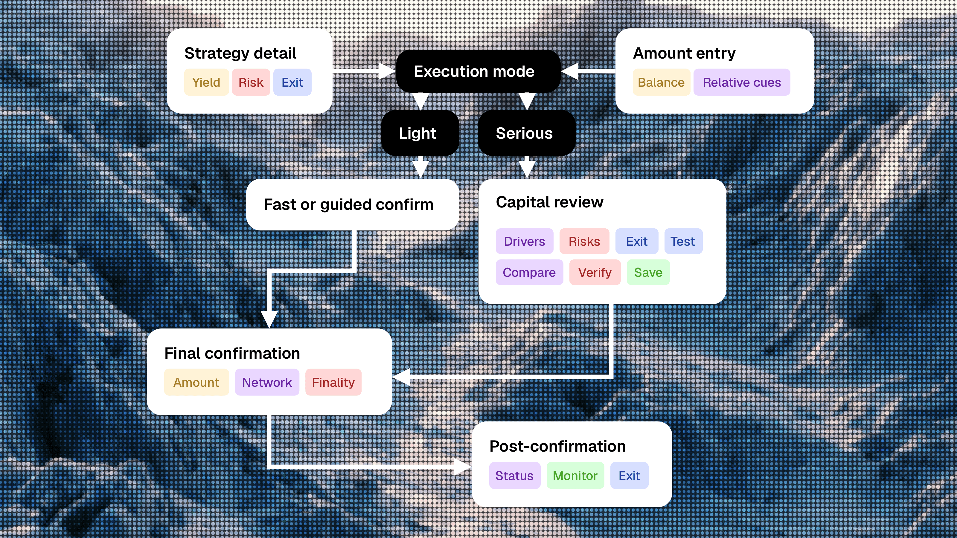
The redesigned journey should begin before the user enters the amount because decision context develops across the entire flow. The strategy page needs to explain the source of yield, current estimate and historical range, primary risks, exit conditions, liquidity notes, historical behavior, and the kind of user or use case the strategy suits. A sentence such as "Best for users who can tolerate variable APY and accept a longer exit window" connects the product mechanics to a real constraint more clearly than a vague medium-risk label.
Amount entry should help users calibrate the action in a factual and neutral tone. The interface can show the connected balance, estimated return at the entered amount, fee impact, and factual relative cues such as the deposit being 6.4 times larger than the user's previous vault deposit or representing 32% of the visible wallet balance. These cues require careful handling because personalized warnings can feel patronizing or invasive very quickly. Their value comes from providing context the user would otherwise calculate manually, while leaving the decision with the user.
Capital review should gather the five pieces of information the user needs before execution: what they are doing, what drives the estimated return, what can change after deposit, how they can exit, and what happens after confirmation. The review should preserve progress and allow the user to leave, compare, inspect a contract, or return later with the decision intact. This deliberate pause brings the user's existing external checks into a faster and calmer product flow.
Final confirmation can then return to a narrower job. It verifies amount, strategy, network, wallet, destination, fee, material risk summary, finality, and expected next state. The action label should describe the transaction precisely, such as "Confirm $5,000 vault deposit," because promotional language near an irreversible action weakens trust and creates unnecessary ambiguity. After the transaction, the product should show status, expected settlement time, current location of funds, monitoring options, exit access, and the boundaries of support. A celebratory success state can wait until the transaction catches up with the confetti's legal confidence.
The native test deposit deserves particular attention because users had already demonstrated demand for it. The product can offer a small suggested test amount, save the original $5,000 plan, and return the user to that plan after successful execution. The explanation should state that the test verifies the wallet, network, and vault setup while market, liquidity, APY, and protocol risk remain. This framing gives the feature a precise and credible scope.
Measuring A Better Decision
Raw deposit completion is a tempting primary metric because it is easy to explain and moves quickly. It is also easy to improve in ways that make the product worse. A brighter action, fewer warnings, less visible risk, and a shorter flow can increase same-session deposits while producing more confusion, support contacts, immediate withdrawals, and low repeat trust. The dashboard celebrates before the consequences arrive.
I would introduce Qualified Capital Conversion as the commercial outcome for serious deposits. The metric would track users who begin considering a deposit above a defined threshold, complete it, retain the position for seven or thirty days, and avoid a confusion or regret support contact within the early post-transaction window. It should be segmented by amount, product type, risk profile, first versus repeat deposit, experience level, and the treatment the user received. The exact formula requires validation with the business, although the principle is straightforward: completion has value only when the user understood enough to remain comfortable with the action afterward.
Hesitation also needs a richer model than abandonment. Time on the final screen, backtracking, opening APY details, expanding risks, checking exit terms, copying an address, comparing strategies, selecting a test deposit, or canceling a wallet signature can represent very different states. Productive hesitation helps the user learn, compare, test, save, and return. Panic hesitation creates loops, unexplained exits, canceled signatures, and support contacts after an under-informed confirmation. The product should move behavior from the second category toward the first and treat useful pauses as part of a good decision.
Instrumentation turns this model into something the team can operate. Discovery events show what the user evaluated, amount events reveal calibration, review events show which decision modules mattered, final events capture execution and hesitation, and post-deposit events reveal whether the user remained comfortable with the result. The event model should include amount tier, relative amount, product type, strategy risk, APY variability, first-vault status, previous maximum deposit, experience proxy, support history, and experiment group. This is design work because responsible improvement depends on the team's ability to distinguish useful caution from confusion.
What We Agreed To Ship First
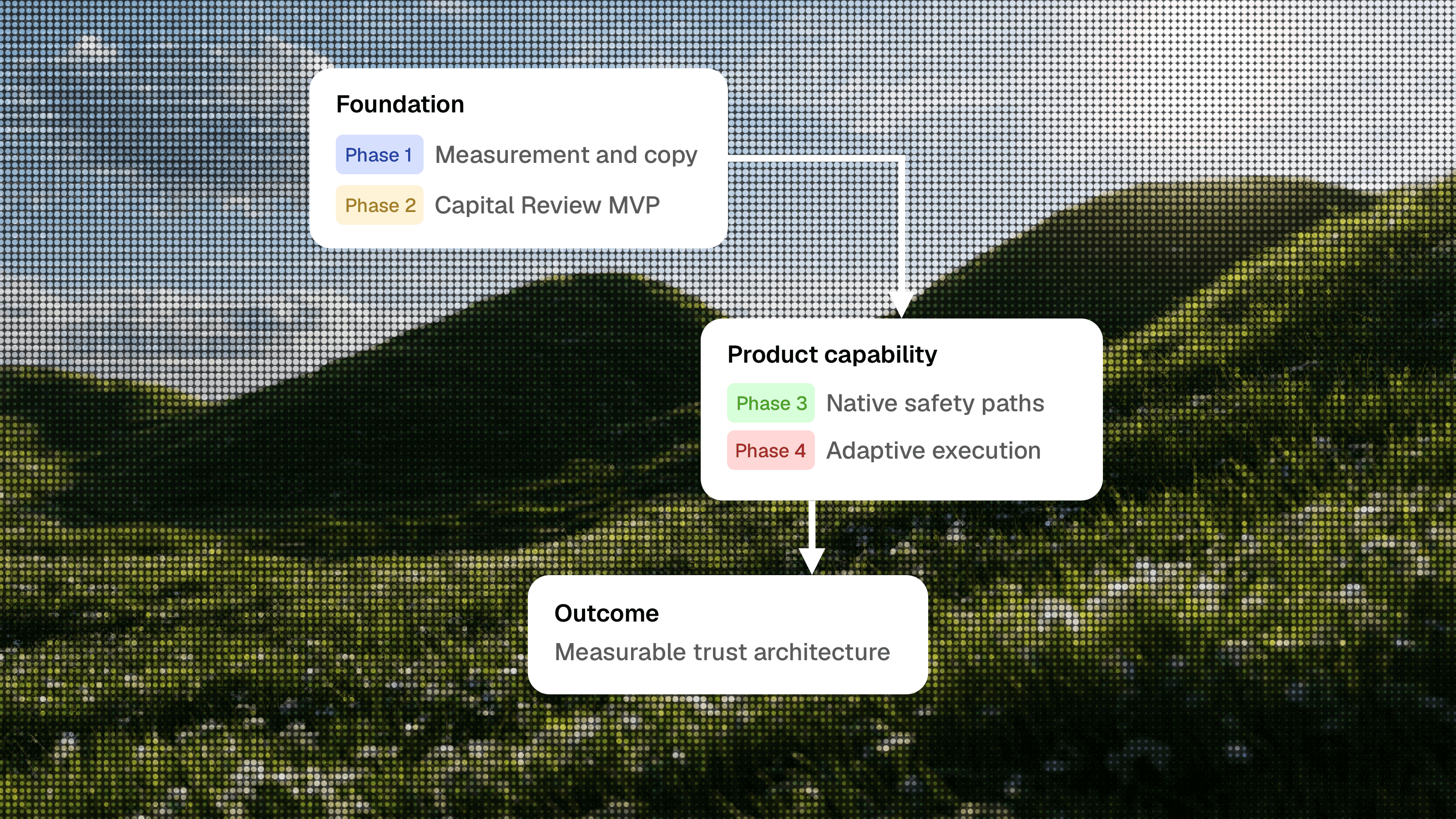
The first release focuses on measurement and obvious credibility problems. Within one or two weeks, the team will segment the funnel by amount, instrument hesitation signals, improve support taxonomy, label APY as estimated and variable with a timestamp, add consequences to risk explanations, and replace promotional final-action copy with precise transaction language. This establishes the baseline and removes some of the signals that currently make serious actions feel lighter than they are.
The next phase introduces a Capital Review MVP for serious deposits, initially using a simple threshold and a limited set of risk conditions. It includes APY assumptions, risk anatomy, exit summary, contextual help, and a precise final confirmation, tested against completion, abandonment, retained deposits, support contacts, and small-trade guardrails. The threshold can remain intentionally imperfect during the experiment because the purpose is to validate whether better-placed decision support improves qualified conversion before investing in a more advanced engine.
Native safety paths follow once the core review demonstrates value. Test deposits, saved decisions, in-product comparison, verified destinations, and post-test prompts bring existing user behavior into the product and make it measurable. The final phase develops the adaptive rules engine, relative thresholds, user-state logic, risk model, and qualified capital dashboard. At that point the work has moved far beyond a redesigned confirmation screen and become a product capability that can support future strategies, networks, and high-consequence actions.
This sequencing also protects the product’s strongest surfaces. Small trades and exploration remain guardrails throughout the rollout, keeping their existing speed and character as serious execution improves. A team can easily overreact to a trust problem and cover the entire interface in warnings, disclaimers, and muted colors. That approach communicates fear more strongly than control and weakens trust in a different way.
The Designer's Actual Job
This case describes the kind of work that becomes awkward when design roles are separated too cleanly. The product designer needs to model behavior, identify the difference between transaction clarity and decision clarity, map the hidden safety process, and redesign the journey around user intent. The art director needs to protect the energy that made the product appealing while giving high-consequence actions a calmer and more precise visual language. The consultant needs to show how fast conversion and trust can reinforce each other once the business brings existing user-created friction into the product.
The funny part is that everyone in the room usually recognizes this work immediately. They just prefer to file it under a cleaner title before procurement, HR, or somebody with a competency matrix gets nervous.
The design engineer needs to make the proposed system real enough to survive contact with the product. That includes component states, threshold logic, data availability, event definitions, fallback behavior, copy rules, analytics properties, guardrails, and rollout constraints. A beautiful Capital Review screen is easy to draw; a review system that appears for the right users, explains the right risks, preserves progress, records useful signals, and respects the speed expected by repeat users requires much more careful work. This is where modern design practice becomes closer to product architecture than screen production.
I have seen this gap enough times to distrust beautiful rectangles with moral confidence. The mockup looks expensive, the prototype feels decisive, and then the first real edge case walks in with muddy shoes. That is usually the moment when design becomes a system or remains a screenshot with better lighting.
I have spent fifteen years shipping products, collected awards along the way, worked as an art director, product designer, consultant, and increasingly as the person who turns the design into something close enough to code that engineering has to acknowledge the difficult states. I am also currently having a remarkably difficult time finding a job, which is either a useful reminder that the hiring market has its own experimental risk model or evidence that I should have added a larger green button to my CV. The self-irony aside, the situation reflects a genuine category problem: companies say they want designers who connect product strategy, systems, visual direction, analytics, and implementation, while hiring processes remain much better at recognizing a tidy title than a person who works across the boundaries.
The market loves hybrid designers in keynote language and punishes them in dropdown menus. Somewhere between Product Designer, Design Engineer, Art Director, and Consultant there is usually a person doing the actual work, politely confusing the ATS while the product keeps asking for exactly that range.
The broader lesson is useful well beyond crypto. Products often become very good at helping users begin an action and surprisingly weak at helping them understand the consequences of completing it. Growth systems naturally favor momentum, while trust is built through appropriate resistance, visible context, and a credible sense that the product understands the weight of the decision. When the action is small, speed communicates competence. When the action is consequential, unlimited speed can communicate carelessness.
The platform needed enough range to stay lively during exploration, stay quick during small actions, and become precise when real capital entered the flow. Users were already doing the work required to feel safe through backtracking, external comparison, manual tests, contract checks, and support conversations. Bringing that work into the product would improve trust, measurement, and conversion quality at the same time, while making the final button's personality considerably less important.