
BlastUP
BlastUP looked like a visual project from the outside, but the real work was invisible UX architecture that cut drop-off through a deeply branching participation flow.
(YEAR)
2024
(TIMELINE)
4+ weeks
(SERVICES)
Strategy
Website


The brief was a two-page Notion doc that explained how the system worked — zero UX, zero states, zero edge cases.
The real problem ran much deeper.
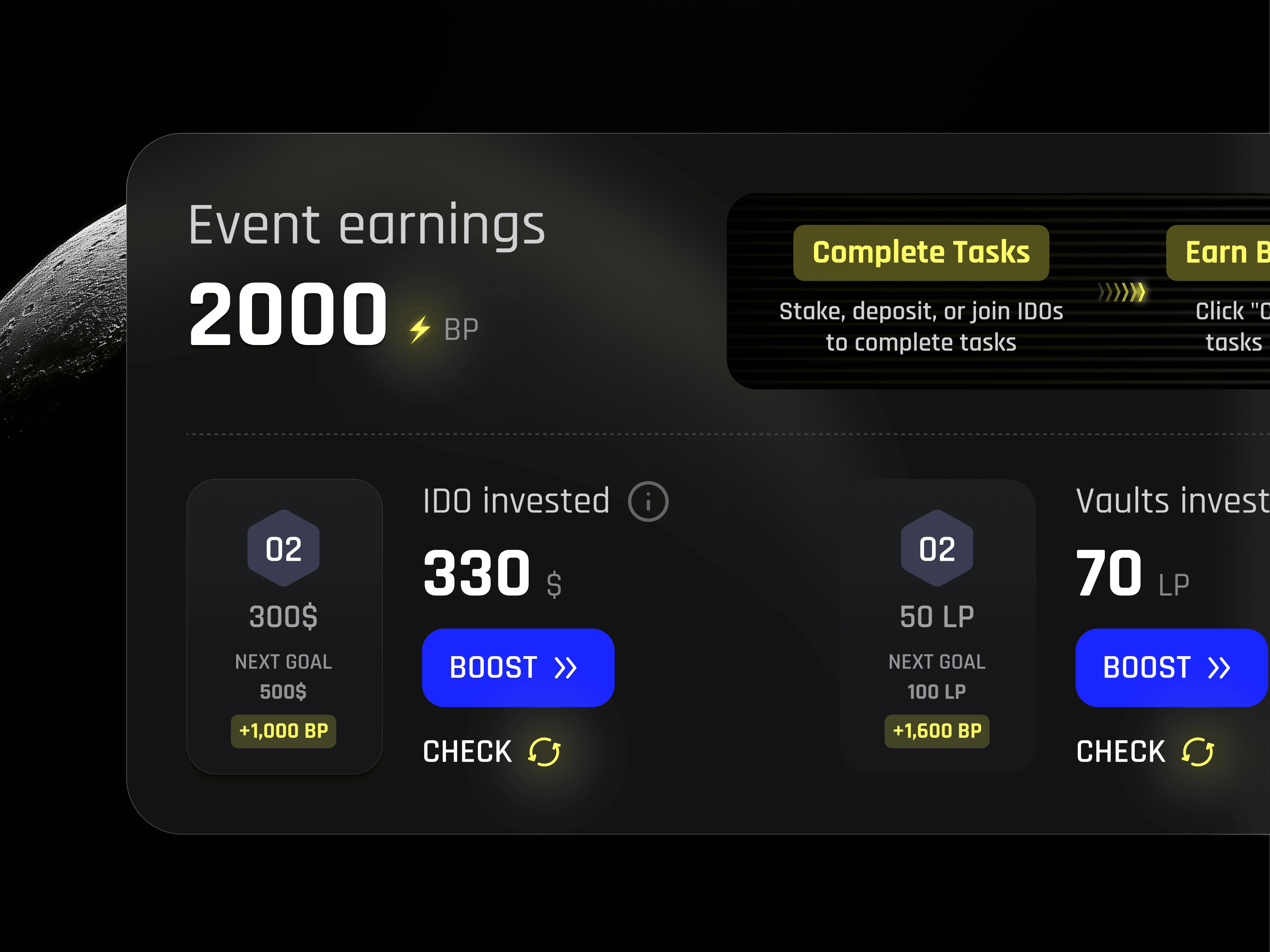
Fragmented flow across wallets, tiers, fiat/crypto, gas fees, and third-party widgets. Multiple branching paths where one wrong click meant real money gone. Obvious drop-off points between “I’m interested” and “I’m in”. Users losing trust exactly when it hurt most — right at payments and external providers.
This wasn’t a UI task. It was a system asking people to make serious financial decisions with no clear path.
We rebuilt it as one continuous flow instead of disconnected stages.
No more “decide later” moments. No tutorials sitting off to the side. Guidance lived inside the actions — you learned by doing.
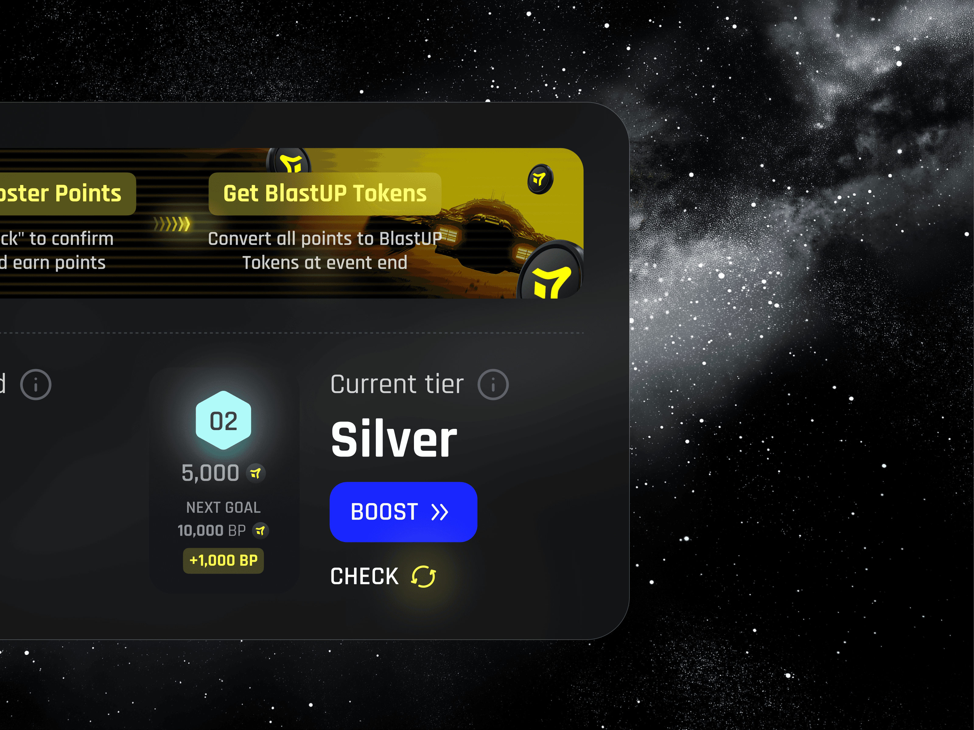
We locked in a 5-step sequence where onboarding melted straight into real participation. Dynamic guidance appeared exactly when needed. Payment choice lived in a clean modal so it never broke momentum. Real-time tier and balance numbers showed up in context. Gas fees got explained before they hit, so they stopped feeling like a surprise tax.
Only after the structure was rock-solid did we design the visuals — clarity, confidence, trust.
BlastUP’s IDO flow went from a leaky, confusing mess to a tight 5-step machine. We didn’t just polish screens — we restructured the whole onboarding-to-staking journey so users never hit a wall, never lost trust, and never had a reason to bounce.
Lower drop-off
Steps from wallet to staked
Payment paths, zero hesitation


“
This. Is. Just. Fucking awesome.

Alex S.
CMO of BlastUP


