Year
2024–2026
Client
CYBRO
Category
DeFi Platform / Rebrand
Product Duration
1.5 years
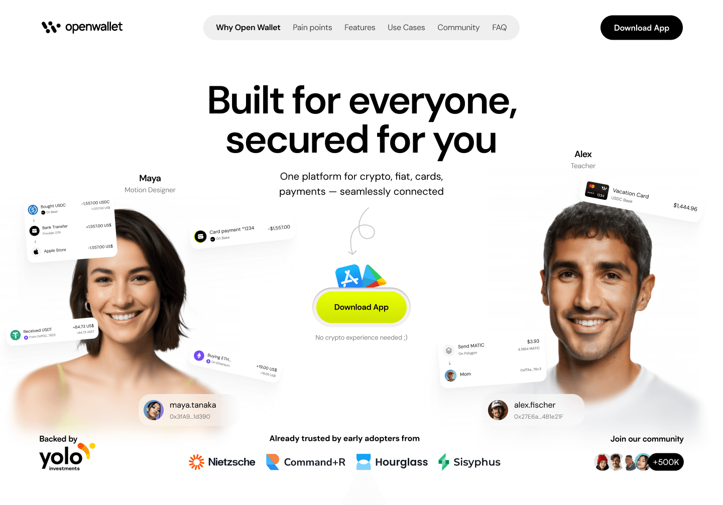
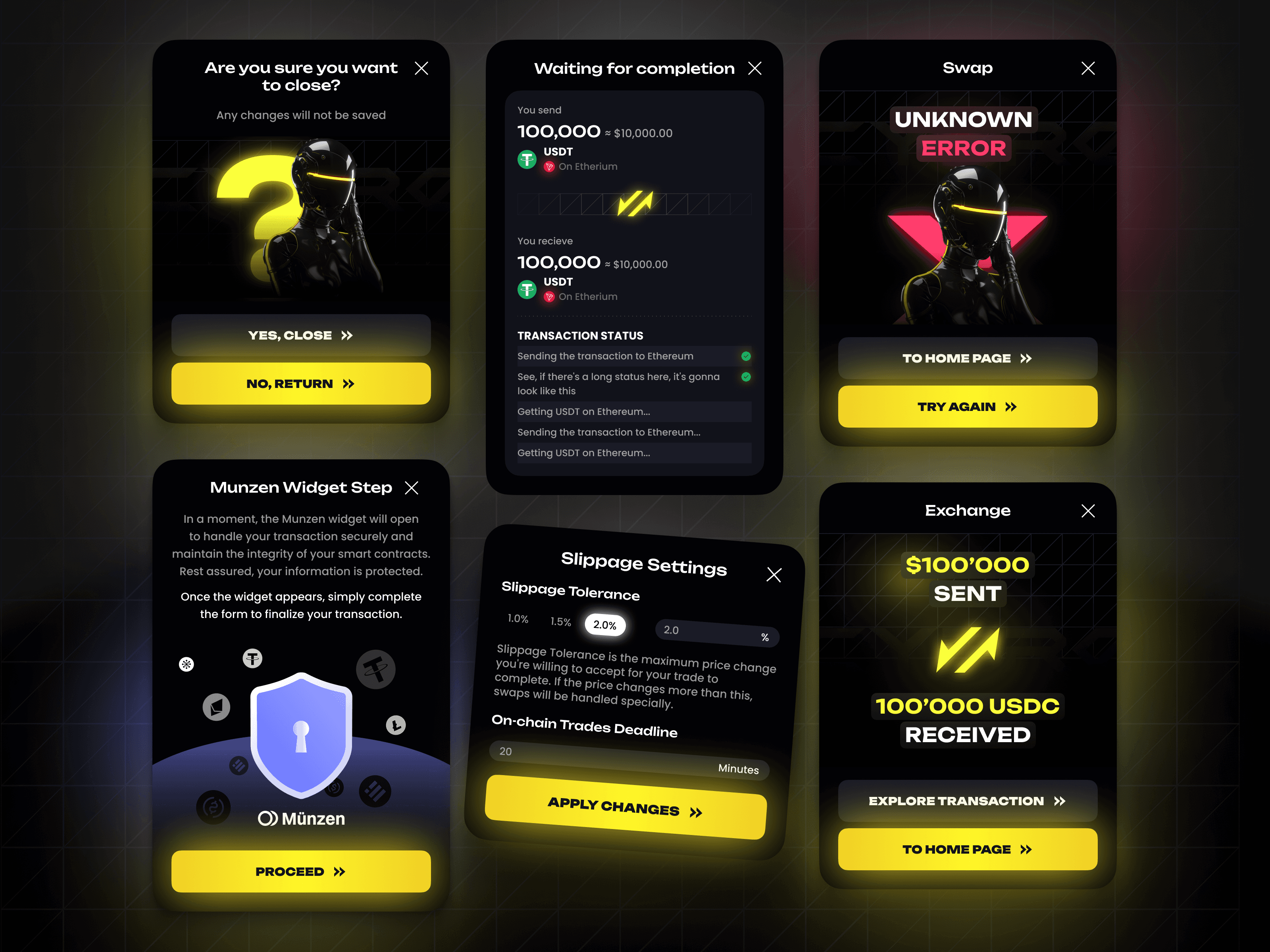
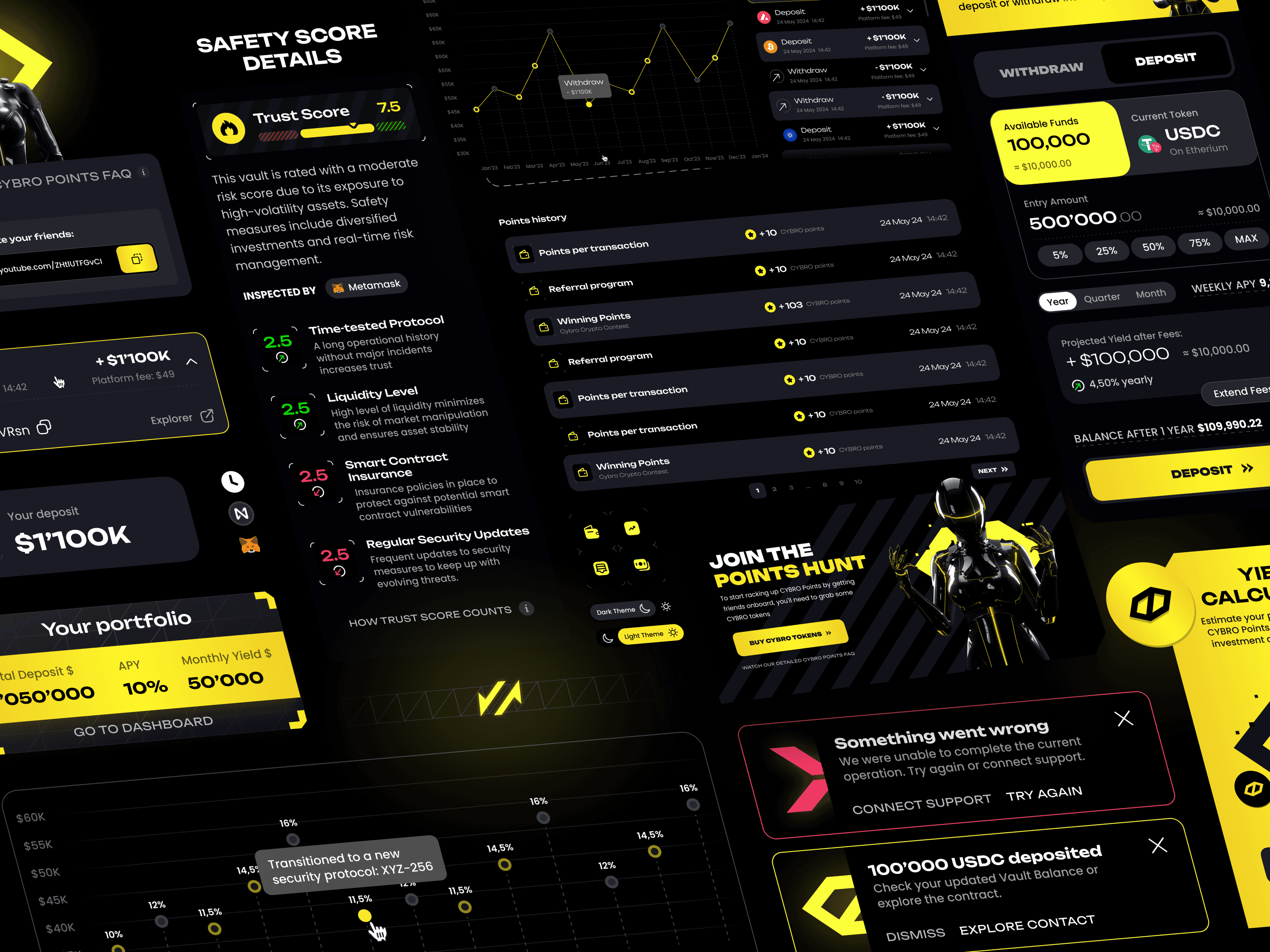
We designed the original CYBRO — yield aggregator on Blast, dApp built in two weeks, the landing that helped sell $7M in tokens on presale. Yellow and black, all-caps typography, neon accents, beavers, 3D robot women in latex suits on the swap page. Over a year we shipped the complete platform, a Telegram Mini App, and kept expanding the visual language. By mid-2025 it was one of the most recognized products on Blast.
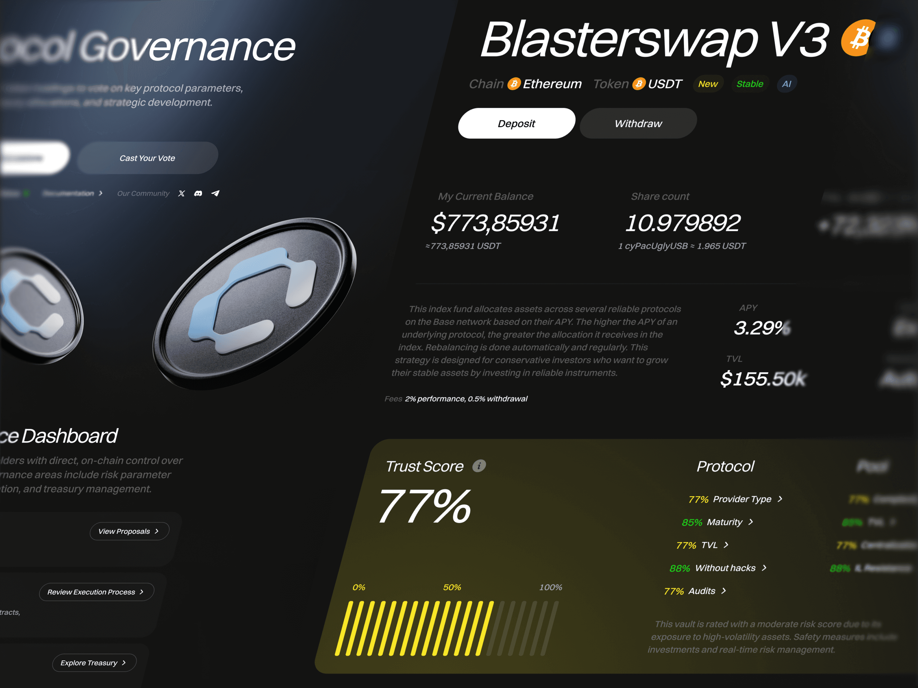
Then they pivoted to professional liquidity management — Uniswap V3, PancakeSwap V3, automation, analytics for users with six-figure LP positions. Different product, different audience, and the audience changed from "crypto-curious person buying tokens during a presale hype cycle" to "someone with $100K who needs tools they can trust."
They wanted to tone it down — remove the beavers, remove the neon. I saw the trap: you can't subtract personality from a brand built on personality. Every visual decision in the original CYBRO was load-bearing. Remove the beavers and the latex robots, and what's left isn't a more serious brand — it's a brand with holes in it, like a jacket with the patches torn off where you can see bare fabric. One Trustpilot review from that period said it plainly: the app was useful, but would be better with "a more professional design — less cyberpunk, more seriousness." CYBRO's response: "a small redesign is scheduled for April." They were talking about us.
So we killed everything we'd built and started from zero.

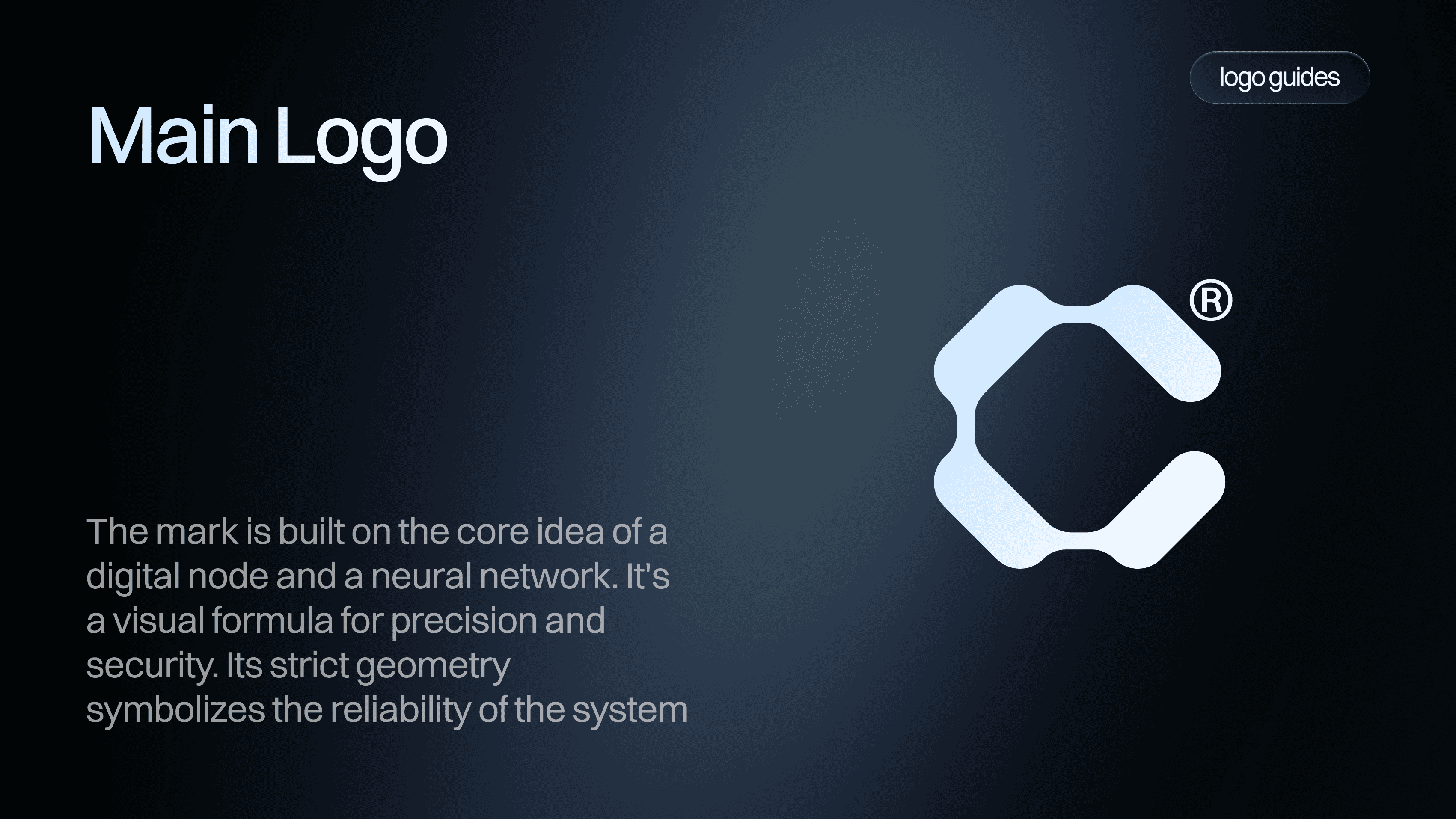
New logo in about a day. A modular "C" from geometric blocks — reads as a letter, works as a pattern, extends into sub-brands. I'm genuinely not a logo specialist and I think the industry overcomplicates something that needs to be good enough and appropriate. This one came out better than good enough.
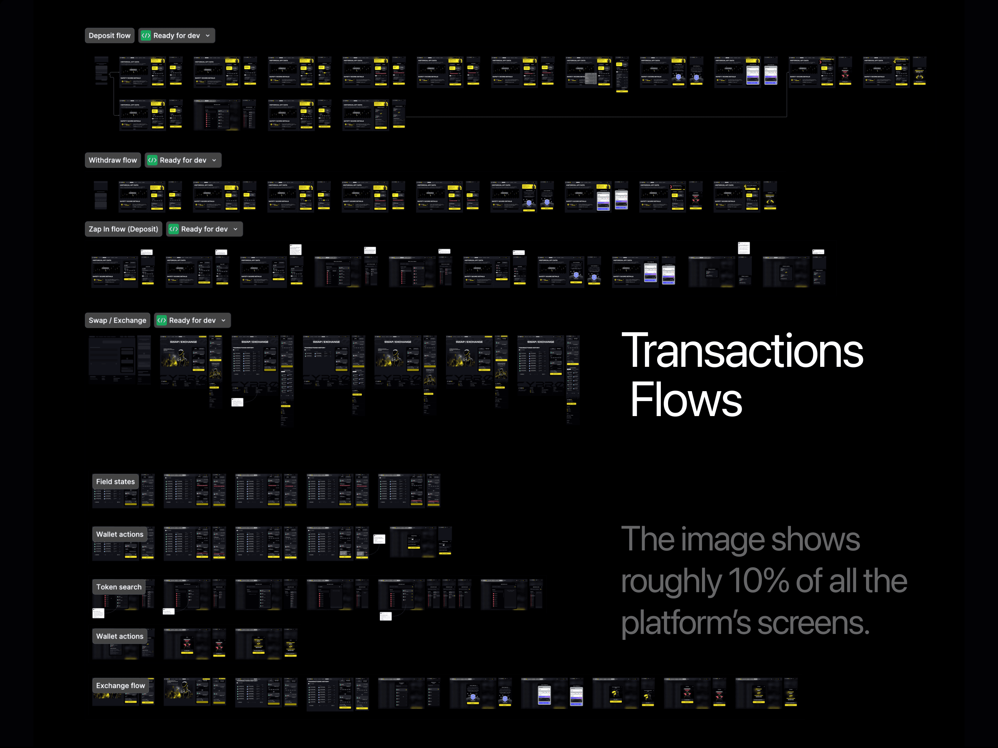
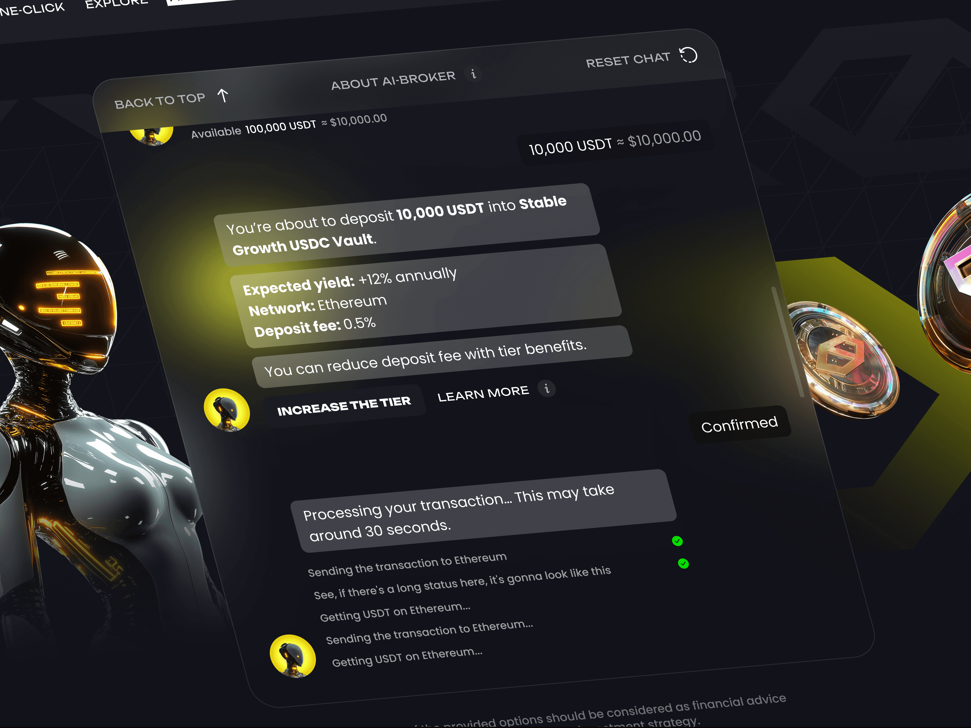
This project was where we first tried AI-generated interactive prototypes at the wireframe stage — I'd dump raw thinking into Claude, it would assemble layouts I'd correct and load into Figma. Worked well enough that every project after CYBRO uses it. But the product manager liked the wireframe look too much and confused the absence of visual design with minimalism. We talked it through, found a middle ground, pulled back on some color intensity, kept the professional finish. His response after the revision: "looks divine."
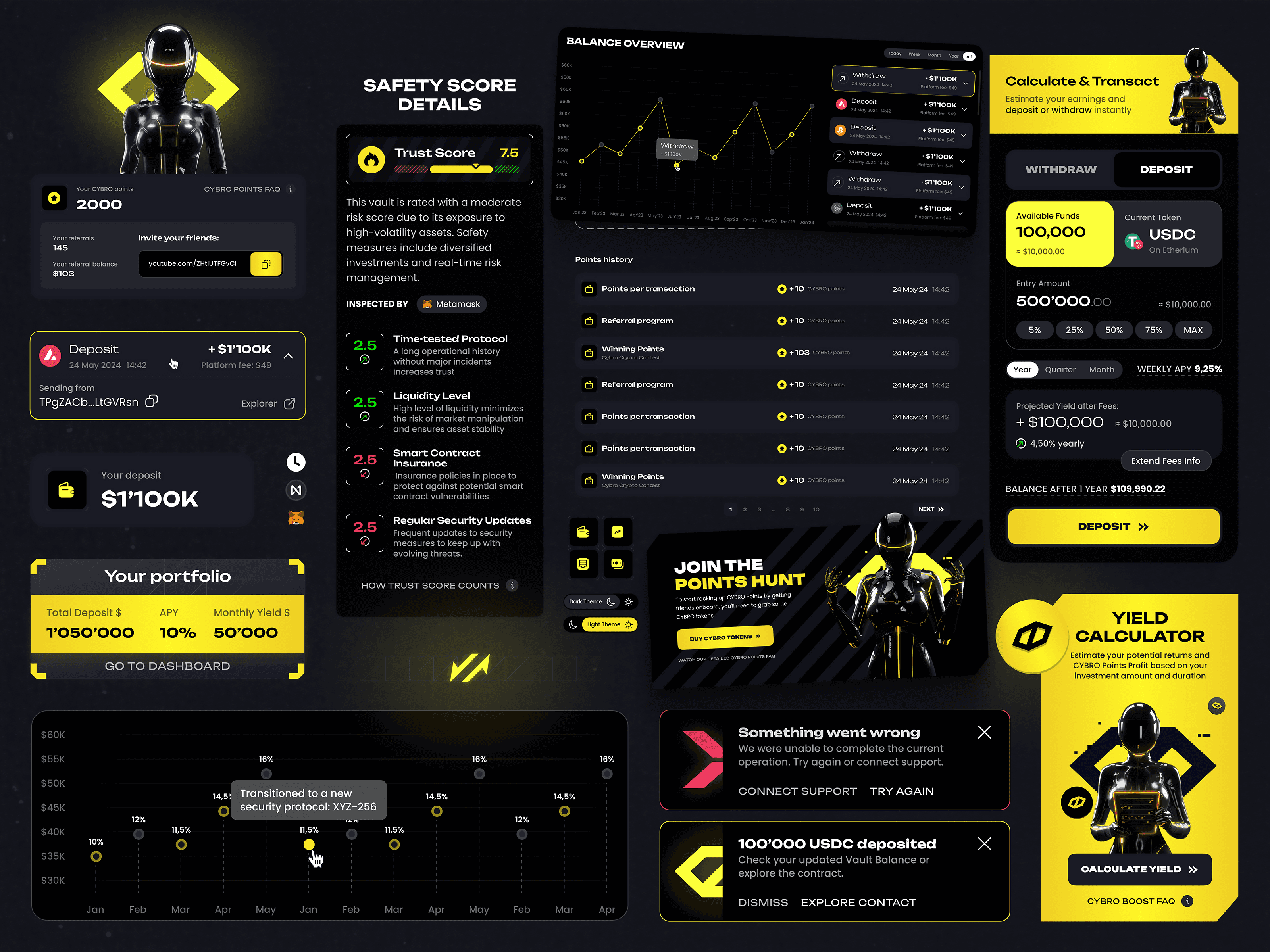
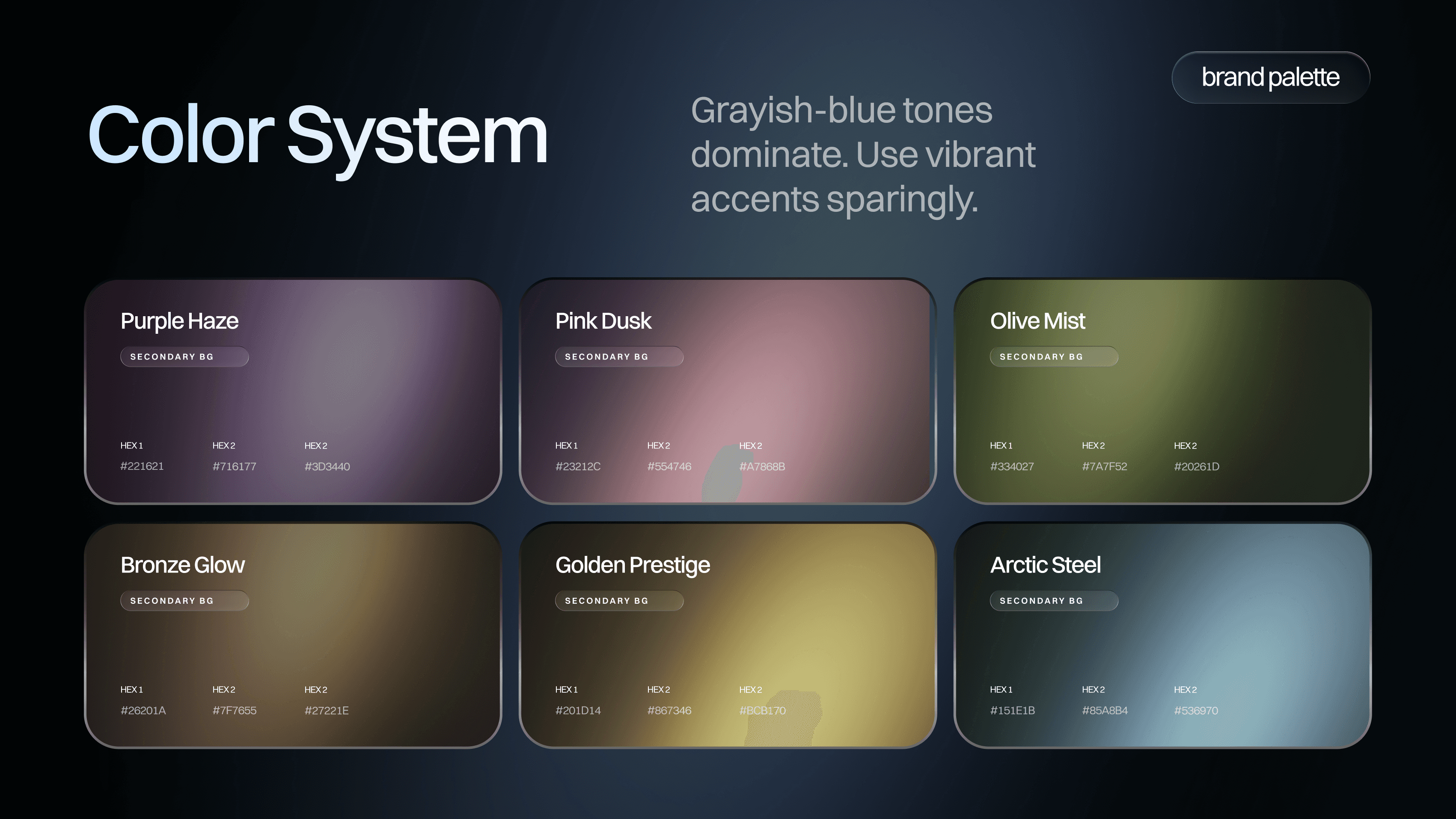
Marie — my co-founder, the product designer — was essentially full-time on CYBRO. She owned the design system, built from zero simultaneously with the frontend developer implementing it. Both negotiating token naming in real time — whether color tokens should represent opacity or distinct shades, whether body and caption typography need separate hierarchies. The developer was meticulous and opinionated, which is exactly what you want and exactly what makes everything slower.
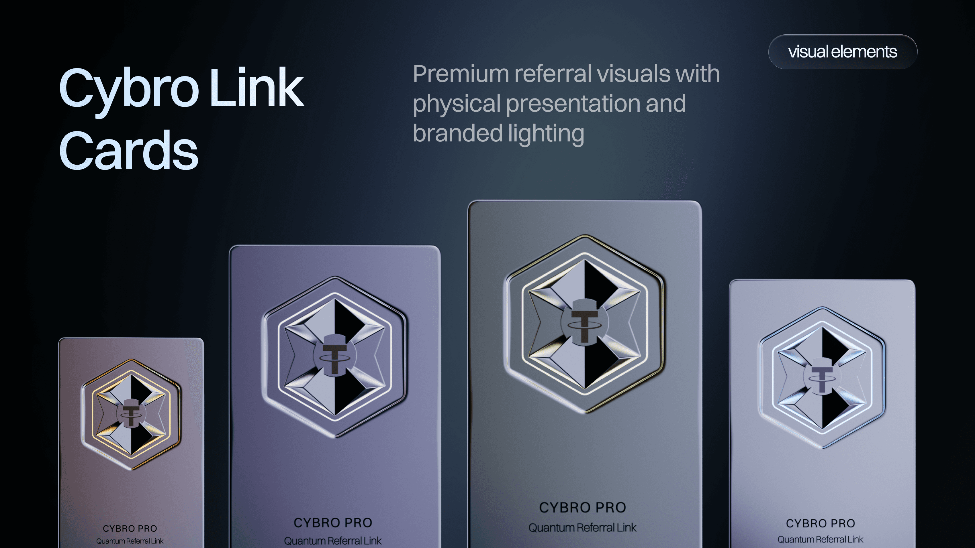
Our 3D artist — same one who built the Arkada NFT collection — rendered the CYBRO token coin as an actual object and built a referral card that flips in 3D, because referral mechanics are inherently boring and the dimensionality transforms a UI element into something that feels like a luxury product you're holding. The frontend developer had never seen anyone ship 3D as video files in a web product and wasn't thrilled about file sizes. We explored Lottie, decided the conversion cost more than the savings, and optimized with lazy loading instead.

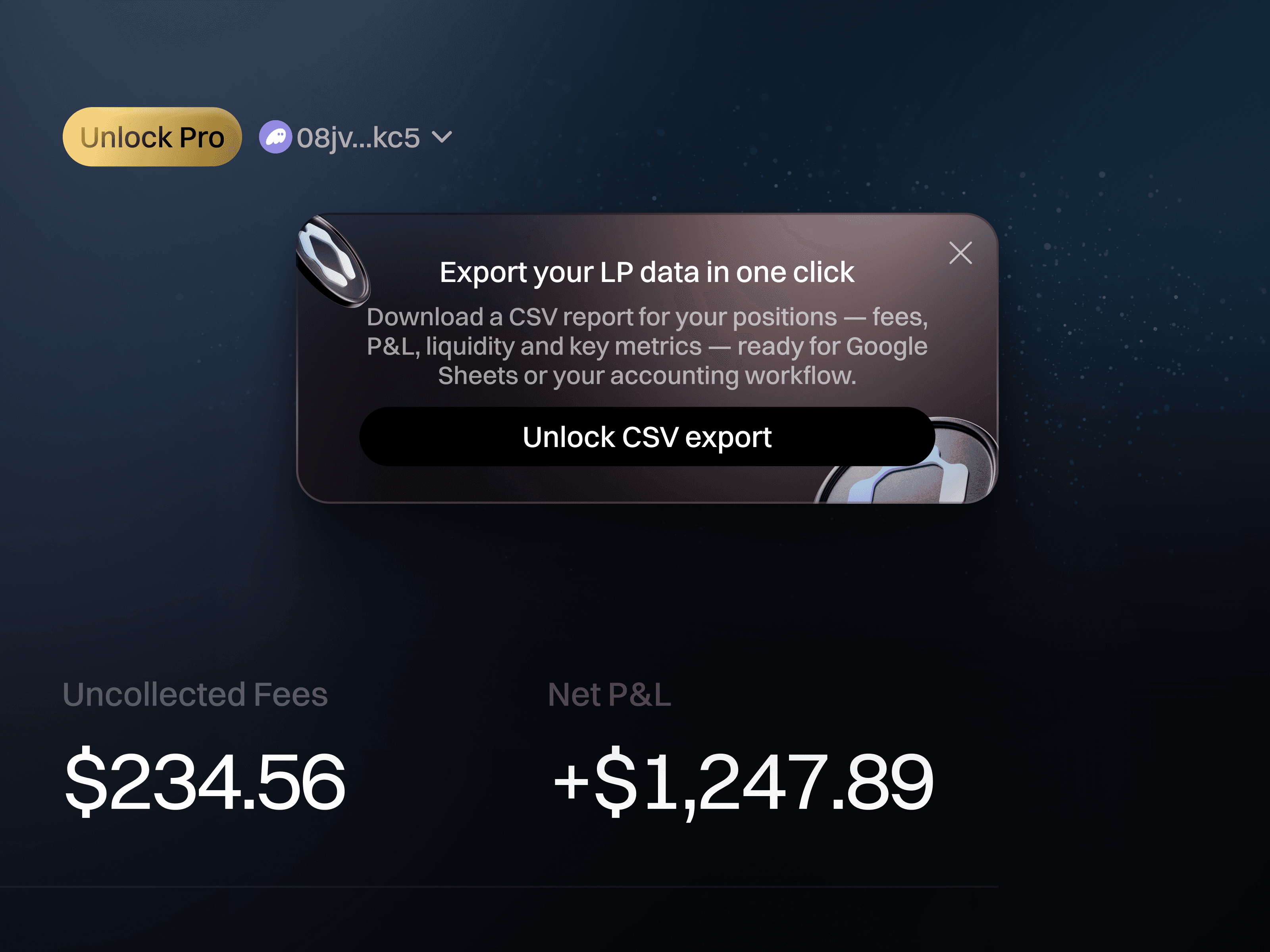
The new CYBRO is live at cybro.io — dashboard with LP position management, vault interfaces, create position flows, automated rebalancing and compounding, token page, governance, staking, referrals, and a Pro subscription tier. Desktop and mobile, every screen designed, every component built from scratch.
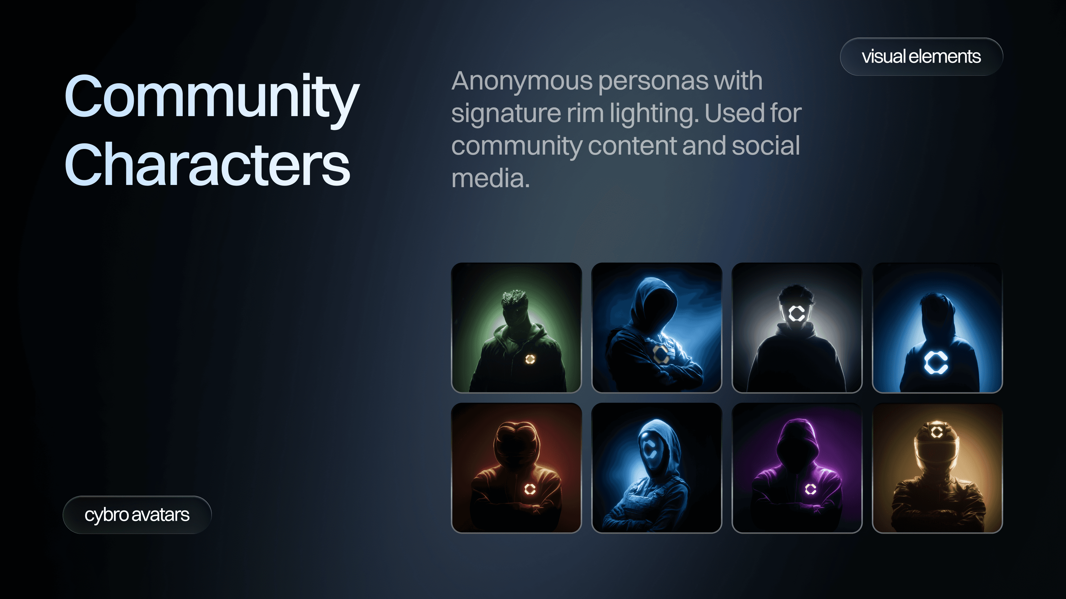
Brand guidelines, pitch deck built in a day when the CEO needed it for a meeting, social media templates, team avatars in Midjourney — each team member in a different colored hoodie or jacket, faceless. The CEO got a gold blazer. The CTO got green. The product manager didn't know what clothes exist besides hoodies, so he got a hoodie. Token icon for CoinGecko — he asked whether to use a transparent background, I told him I genuinely didn't understand why he'd want that, he agreed.
Christmas decorations in December — glass-morphism header with snowflakes, Santa hats on all team avatars. Nobody asked for this. Marie flagged a "0/5" label in production that read as "zero out of five used" when it meant "zero remaining." You watch the product after handoff.


A molt is when an animal sheds its outer layer because it's grown too large for the covering it has. The old structure isn't damaged. It's outgrown. CYBRO molted, and we happened to be the people who built both skins — the rare case where the designer's job is to look at their own shipped work and say "this was right, and now it's wrong, and I need to be the one to replace it."
Both versions are good design. The difference is who they're for. The thing that carried across is the team that watches the product after handoff, proposes things nobody asked for, and argues about padding until the padding is right.